Dripping In Swag: 25 Of The Best Uniforms College Football Delivered In 2021
On:
Dripping In Swag: 25 Of The Best Uniforms College Football Delivered In 2021
By Simon Carroll
When it comes to College Football, there’s winning in style, and then there’s winning – IN STYLE. For some of the teams on this list, victories may have been hard to come by in 2021. But they certainly finished the season amongst the top 25 in the fashion rankings…
You won’t find any of the traditional colours making the cut – you’ve got to me more adventurous than that. But any program ameding their look are eligible, alongside some of the amazing speciality uniforms that graced our Saturdays last Fall. Enjoy!
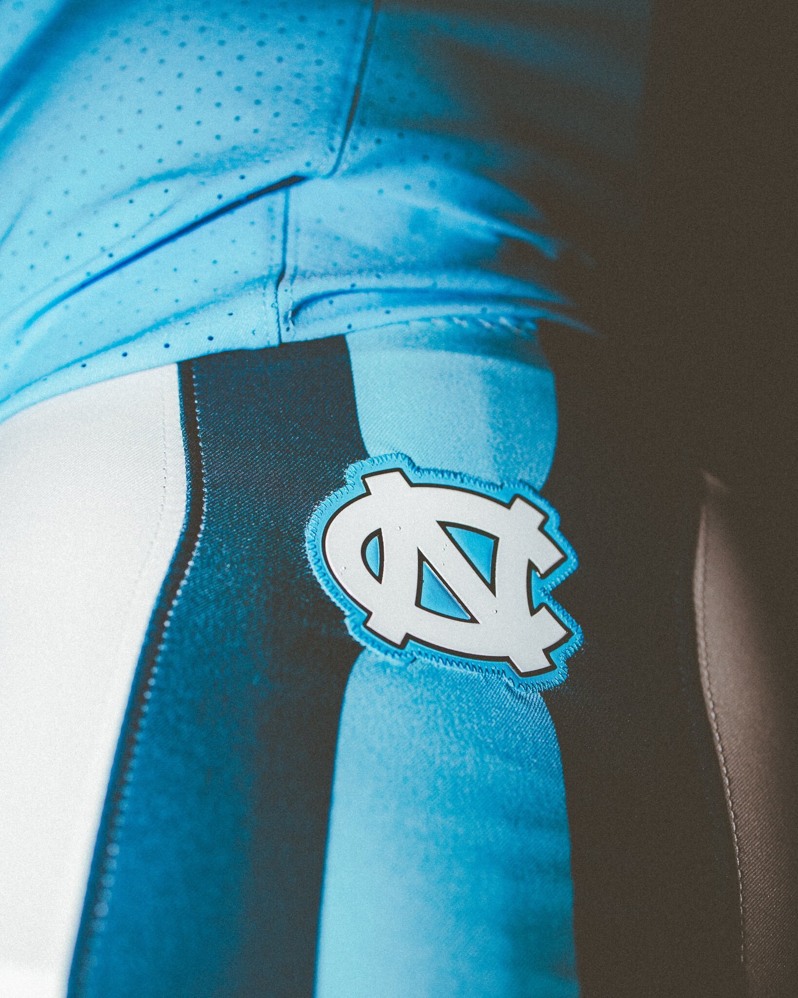
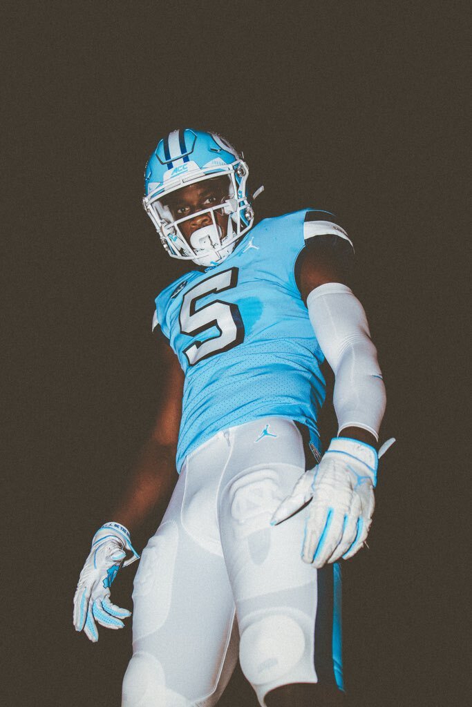
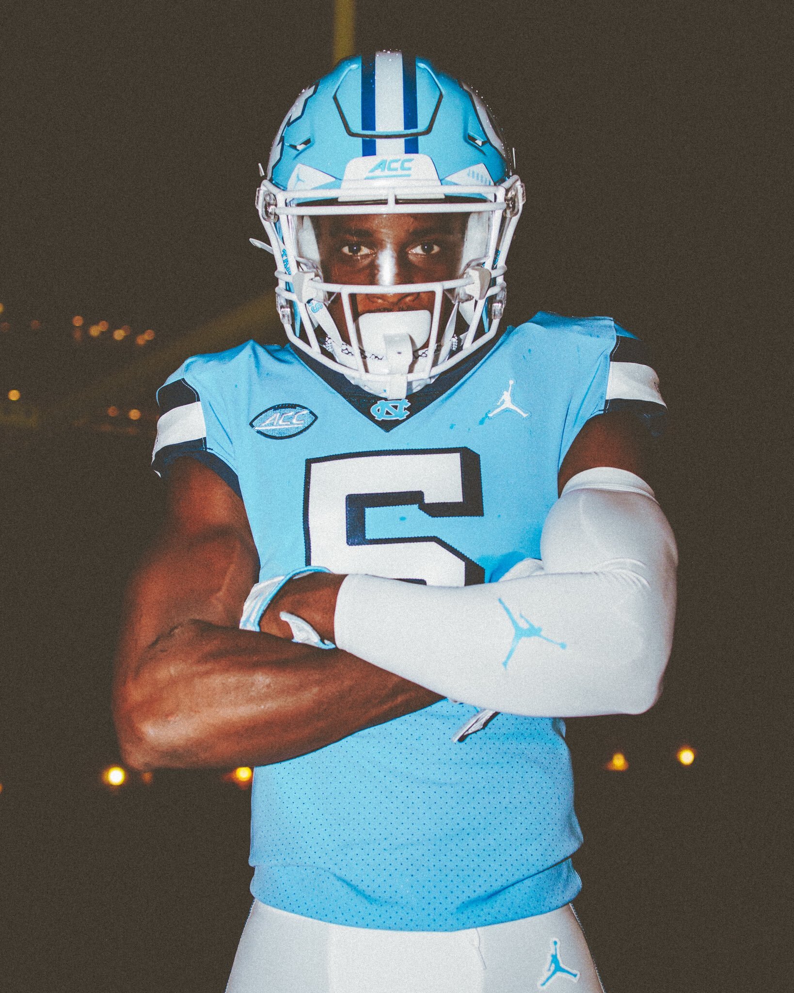
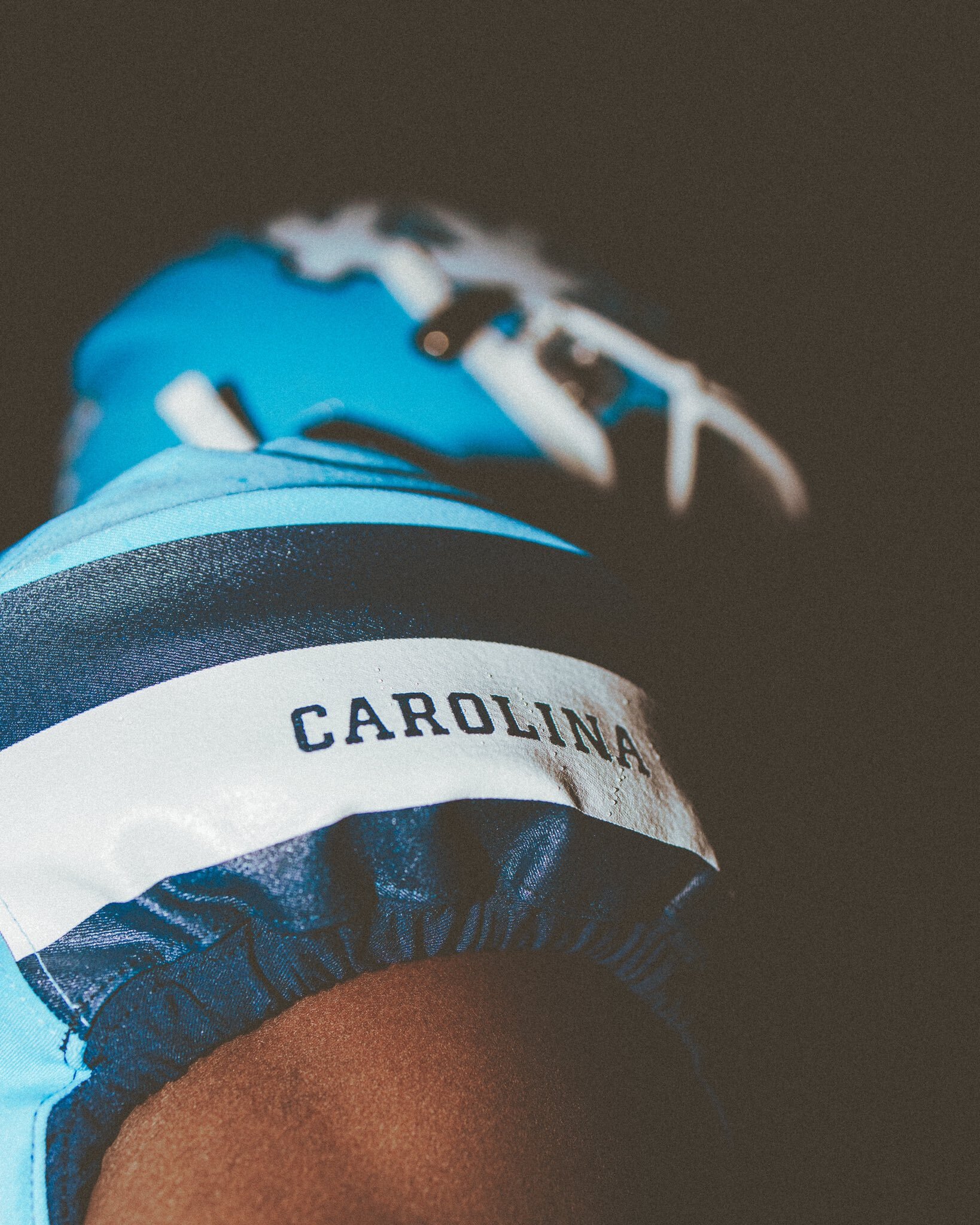
25: North Carolina - 'Throwbacks'
The Tar Heels are perennial winners when it comes to gameday attire. True – in the late eighties they may have lost their way a little aesthetically, but when you have a colour scheme as on point as powder blue and white, the Air Jordan brand was always going to produce. In recent seasons we’ve seen some very nice use of linking diamonds as effecitve touches, but it’s a blast of nostalgia that sees them sneak into the top twenty-five of 2021…
Throwbacks will NEVER get old. UNC sported these bad boys against Virginia last year as a tip of the hat to head coach Mack Brown’s first stint in Chapel Hill back in the 1990’s. Drop-shadow numbers and wider stripes on the shoulders bring back memories of Jeff Saturday and Julius Peppers. Inject it into my veins.
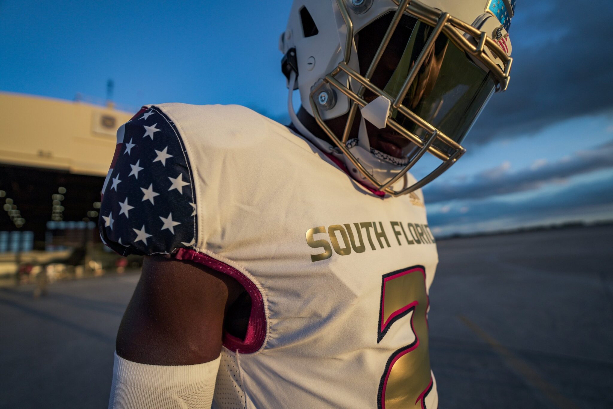
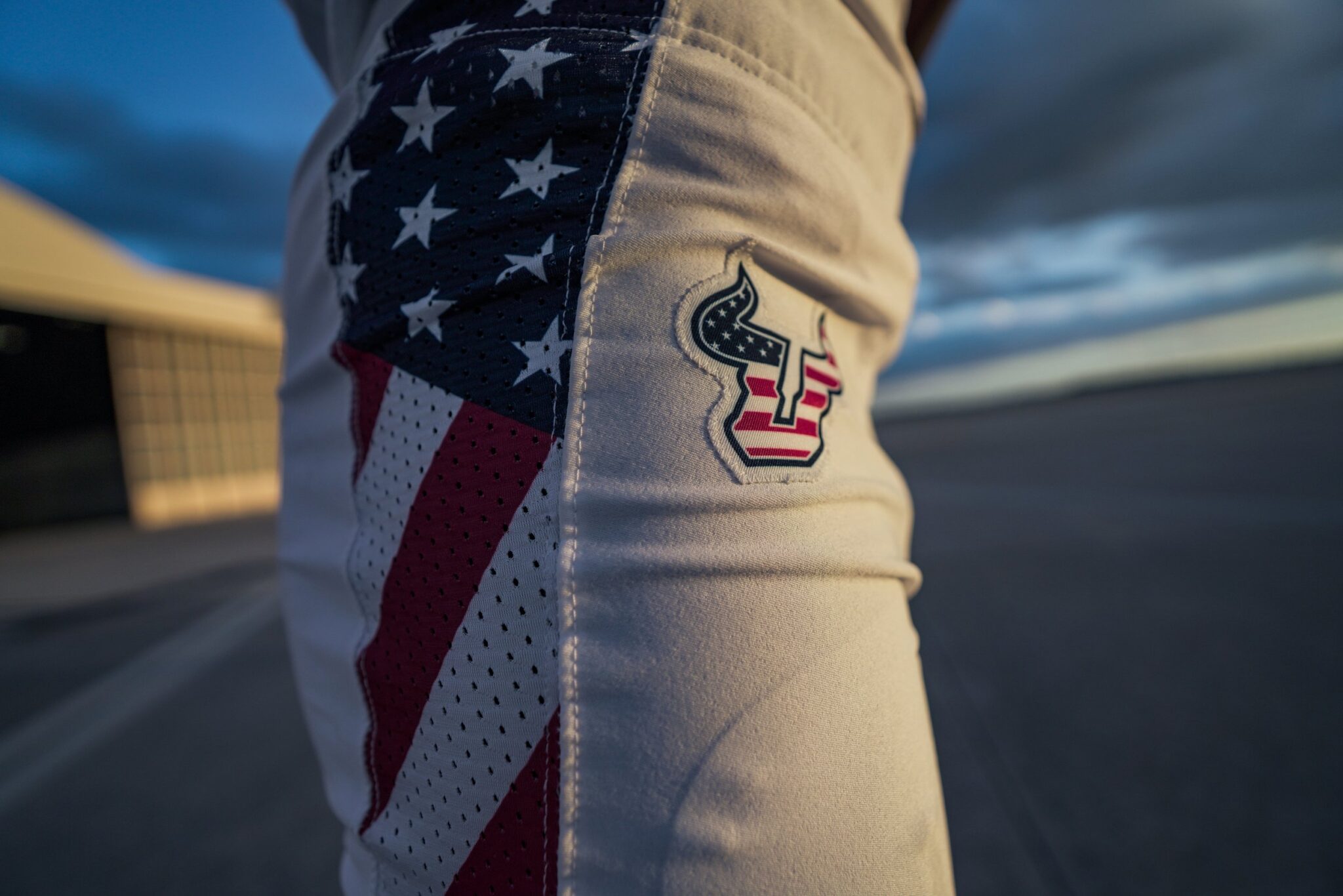
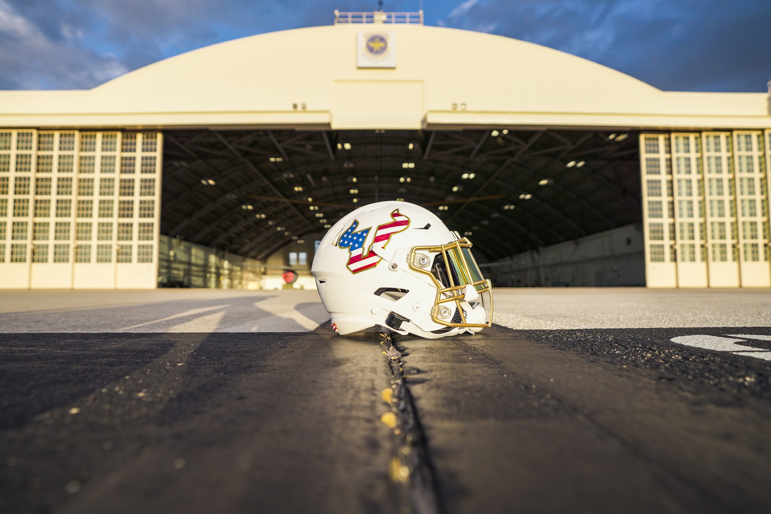
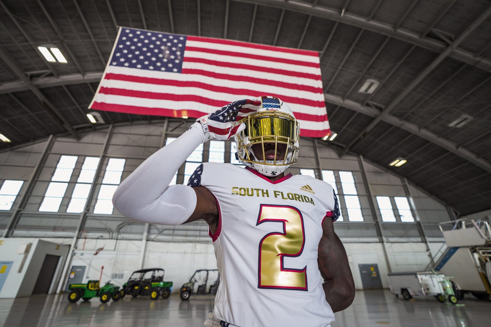
24: South Florida - 'Salute To Service'
Respect to the nation’s military history is commonplace amongst American sport, and college football is no different. The service academies do not let us down when it comes to natty attire – more on those guys later – but Veteran’s Day gives other programs a yearly opportunity to show their appreciation to those who protect and serve.
Eschewing their usual green and gold (only the numbers show allegiance to their traditional colours), USF led the pack when it came to their salute to service. With the stars and stripes adorning not only the panels on the pants and shoulders, but also their logo on the helmet too, The Bulls delivered a truly patriotic uniform – with the photo shoot held on MacDill Airforce Base just seven miles south of their home in Tampa.
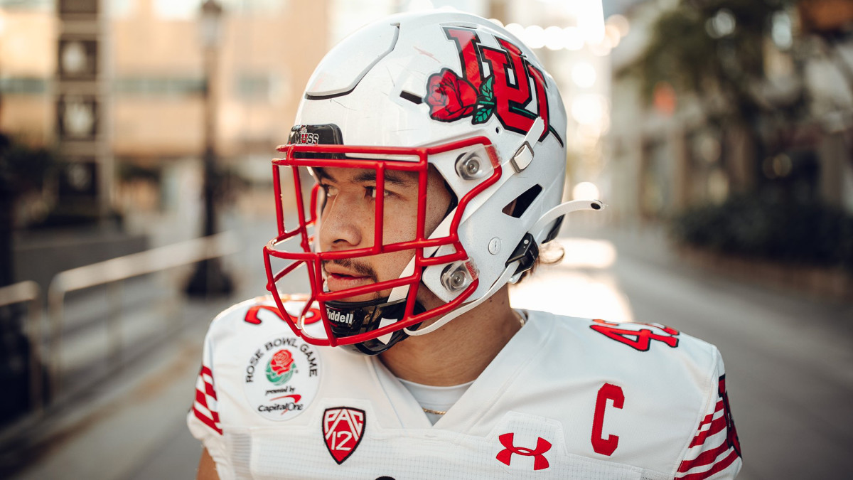
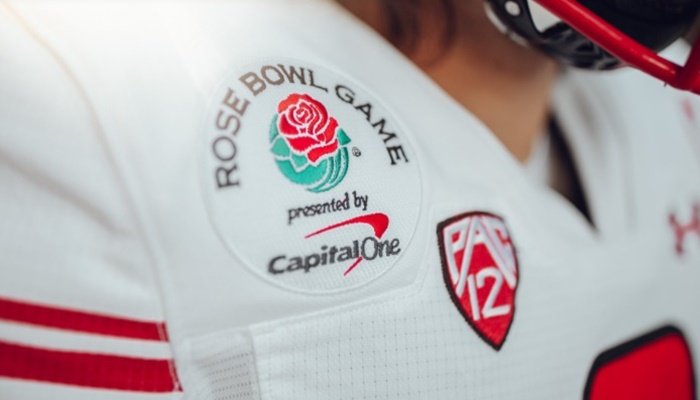
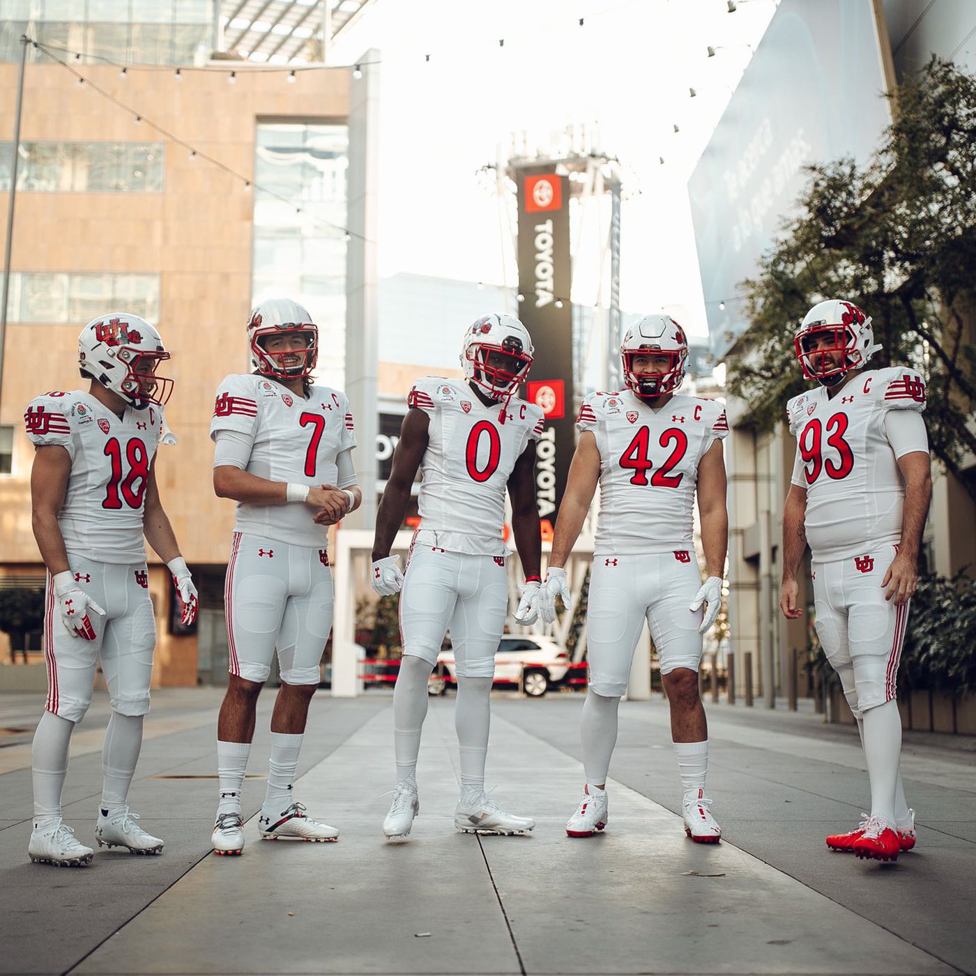
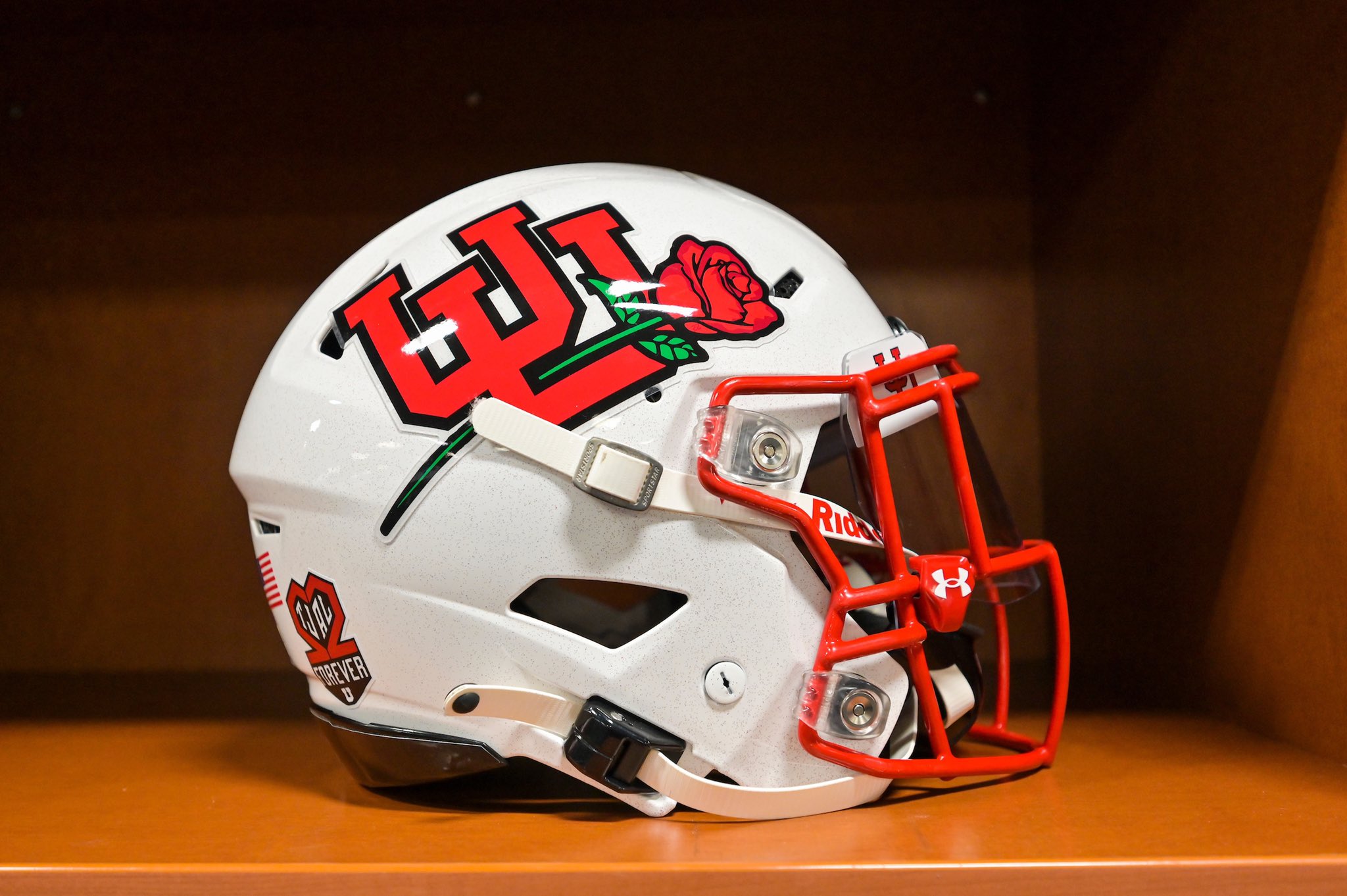
23: Utah - 'Rose Bowl Whites'
When it comes to speciality uniforms, Utah are pioneers – and this won’t be the last time they feature on this list. But before we spoil the rest of the article, The Utes deserve immediate credit for fully embracing their recent trip to Pasadena, California.
After an impressive PAC-12 Championship Game victory over Oregon, Utah booked their place in one of the most prestigious bowl games in the sport. Most teams would happily add a decal to their jersey and be done with it, but not this program – The Utes went the whole hog, amending their helmet logo to incorporate the red rose that ths game is famous for. A subtle touch, but more thn most would have done, and for that they get due credit.
Sadly, they lost to an incredible Ohio State 4th quarter comeback. But they’re winners in my eyes.
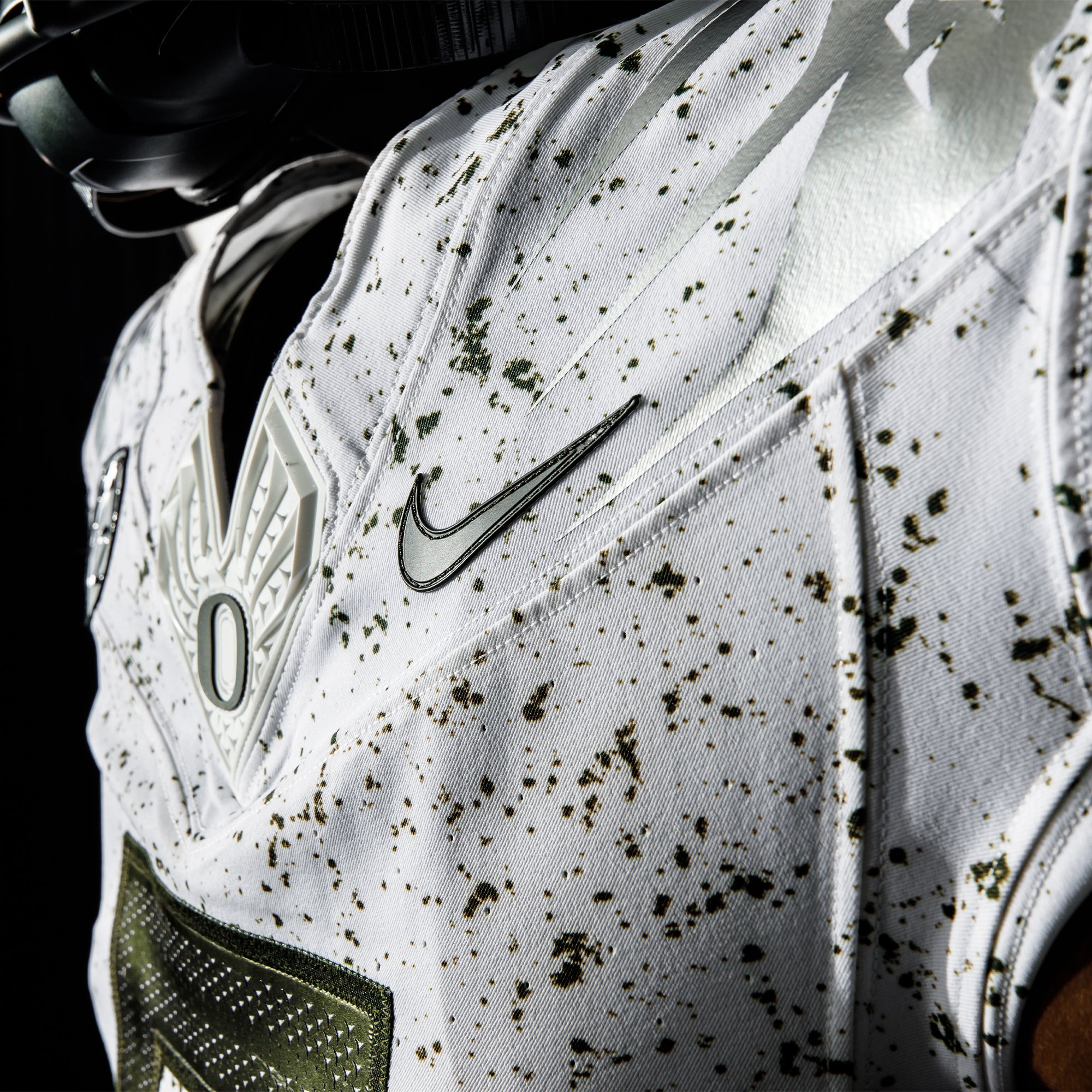
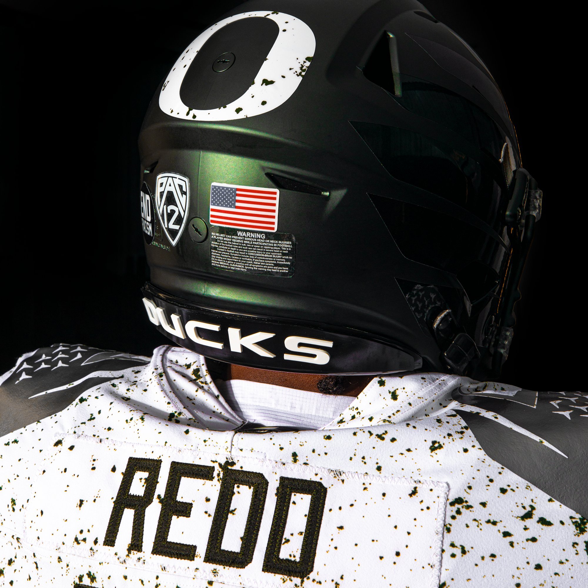
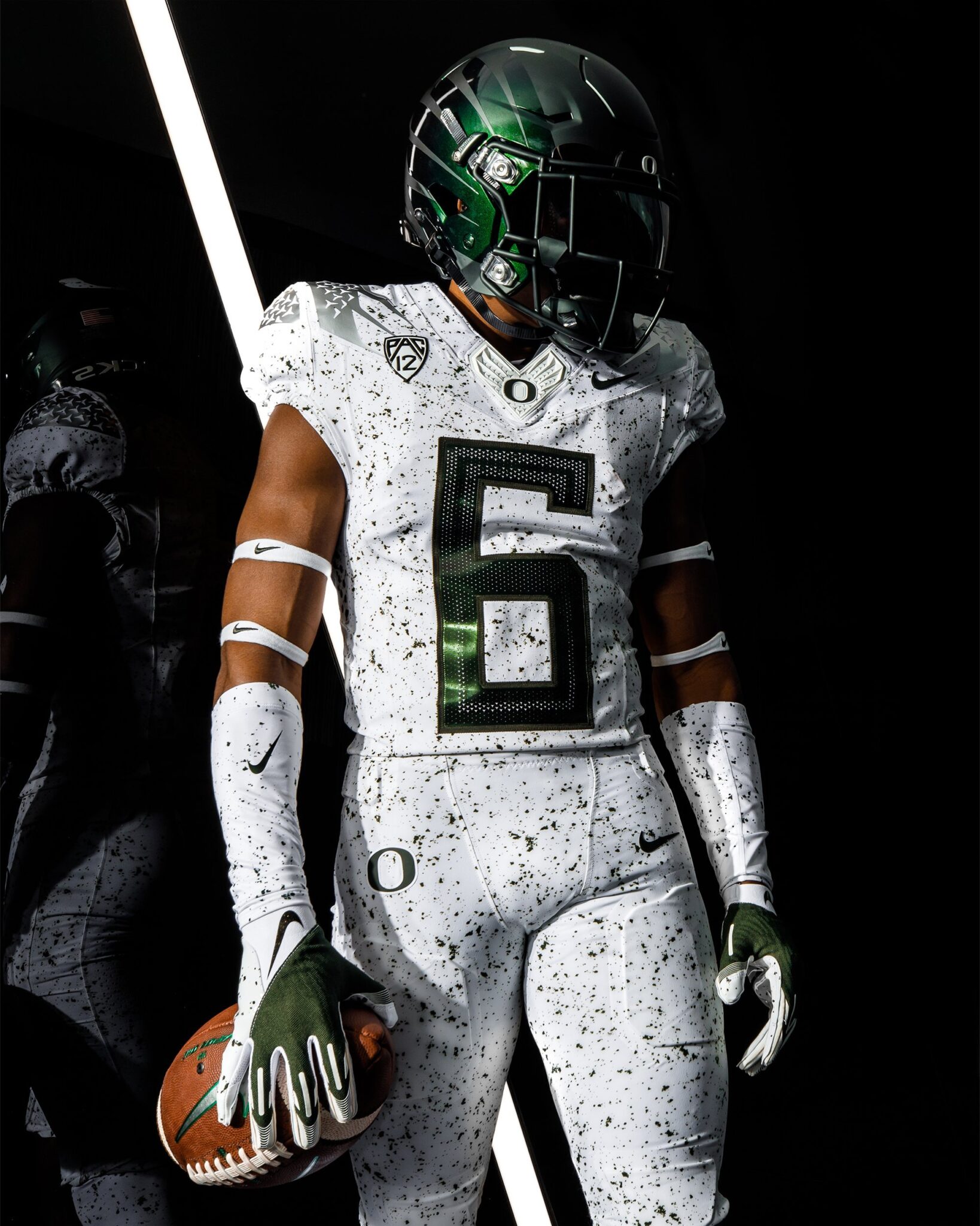
22: Oregon - 'Eggshell'
Well this is going to split opinion…
Oregon are famous for their array of eye-catching uniforms. Personally, I’ve never been that fond of them – bold isn’t always best, and The Ducks usually border on garish. But they deserve respect for their ambition when it comes to style, and it’s fair to assume other teams have used them as inspiration for their own changes.
In week 8, The Ducks unveiled their ‘eggshell’ uniforms, an off-white ensemble speckled with grey-green flecks and finished with a matte green helmet. The oversized numbers remain but for me it really works – and whilst others may not be so enamoured with it, I think it’s a triumph of creativity. It looks like an oreo milkshake, and i’m all for it.
21: Kent State - 'Baby Blues'
If you’ve got an issue with light blue, or powder blue, or baby blue – whatever you want to call it – then we’re not going to get on. As a Chargers fan, I am uniquely qualified to know what a nice jersey looks like, and a blue and yellow colour scheme is always easy on the eye.
The MAC needed some representation in this list, and this uniform is well worthy of a spot in the top 25. The Golden Flashes sported this combo in week 9 when they hosted NIU for a spot of prime-time Thursday night #MACtion. The jerseys are a pleasant alternate to their usual darker blue colours, but the black and yellow number outline really makes it pop. Yet the helmet steals the show, with the throwback lightning bolt on the left and player number on the right.
Dustin Crum looked a vision in baby blue, but sadly succumbed to the rampant Huskies. Thankfully, Kent State have now shared their new colours with their other sports teams – and the baseball jersey in particular is a knockout. Let’s hope we see more of this kit combo in 2022.
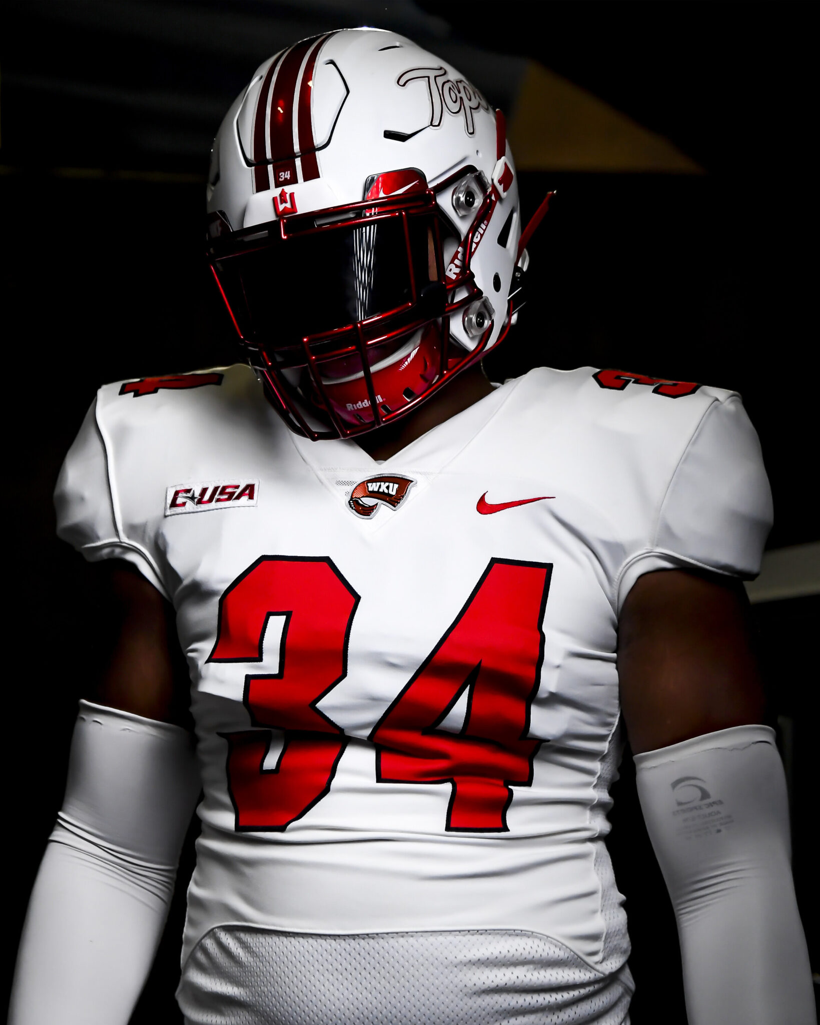
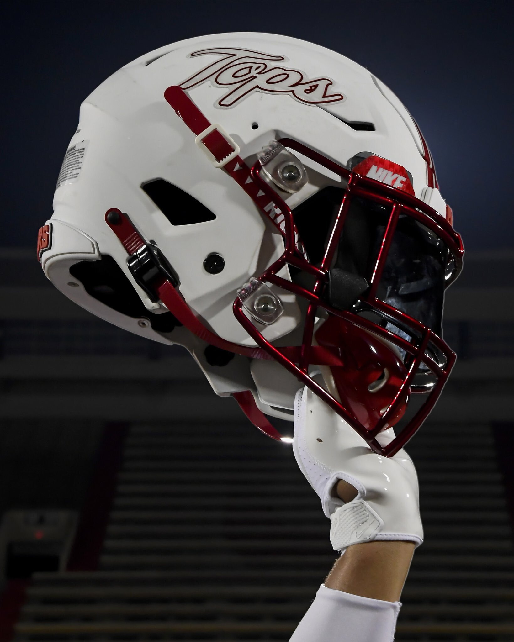
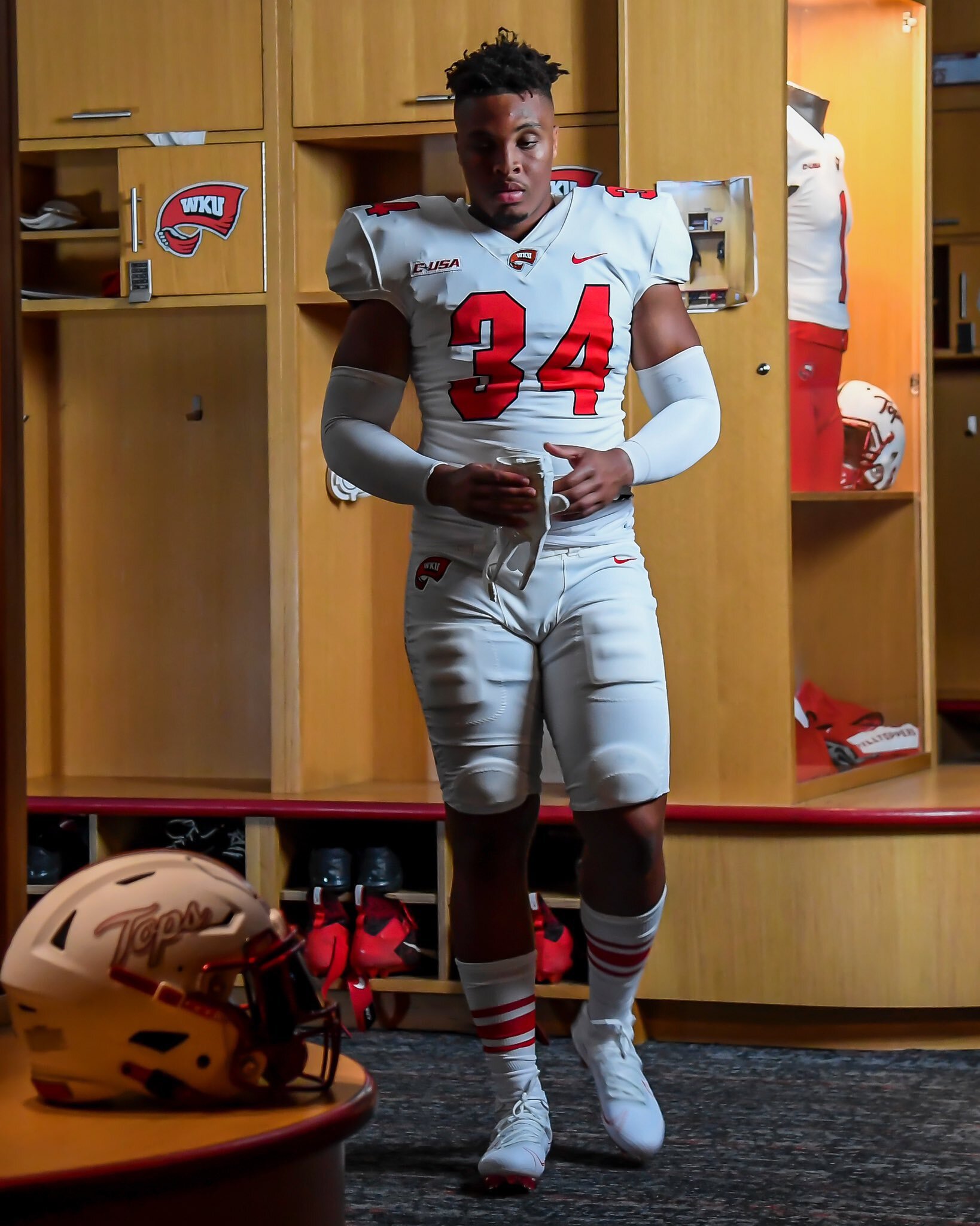
20: Western Kentucky - 'White Out'
No doubt I’m in the minority when I say this, but in most cases I would argue that a school’s alternate white uniforms are better than their home colours. White is just so CLEAN! And to double down on the theme, going all white from top to toe is enough to have me drooling. The ‘whiteout’ theme is spreading through college football, and in my humble opinion, Western Kentucky topped the lot last year.
The Hilltoppers kicked off the season dismantling UT-Martin. And whilst many would say the arm of Bailey Zappe had a lot to do with it, I think if you look good, you play good. Even the extras – gloves, cleats etc – were white, with just the chrome red face mask offering a powerful contrast. To top it off the helmets sported the ‘Tops’ script logo. An absolute triumph.
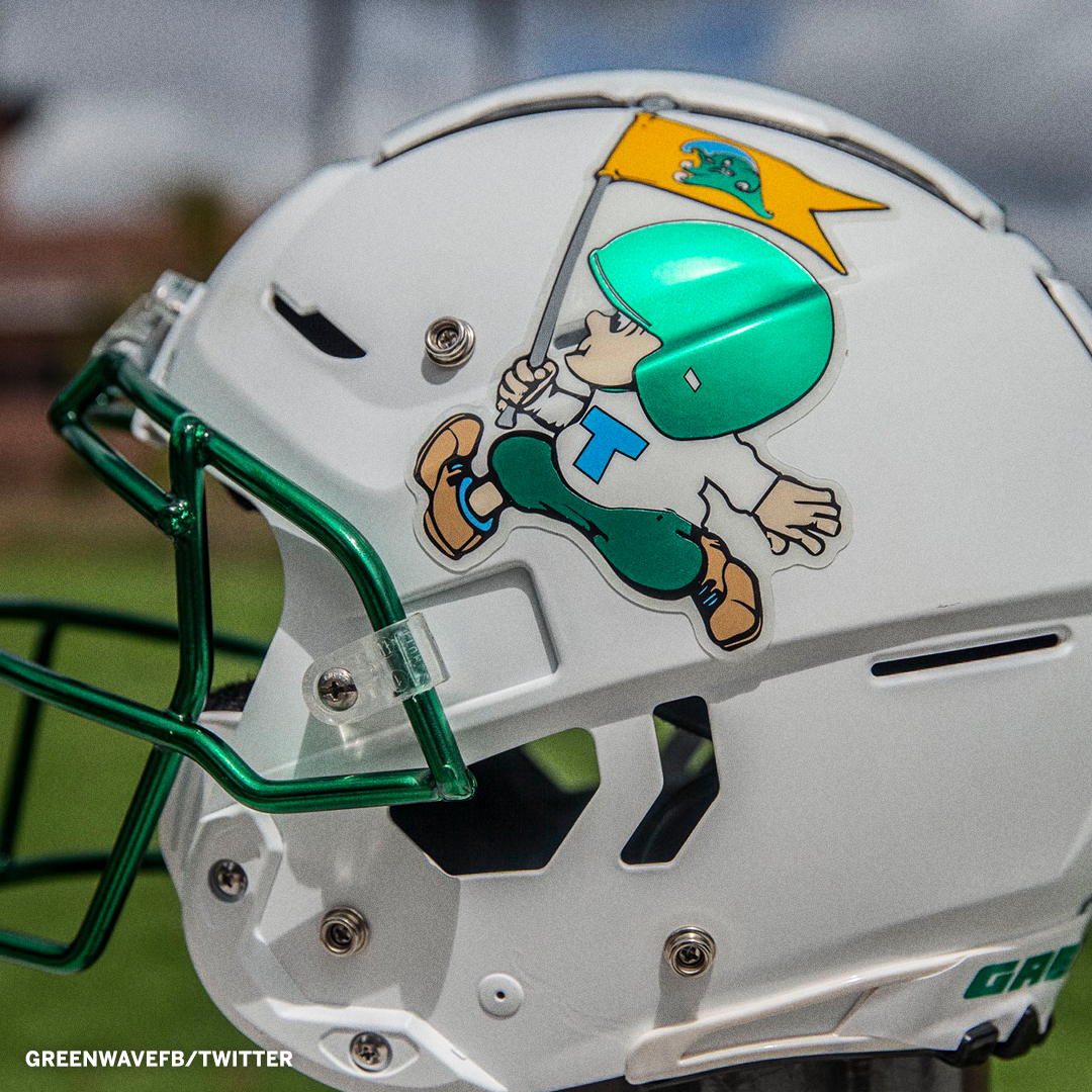
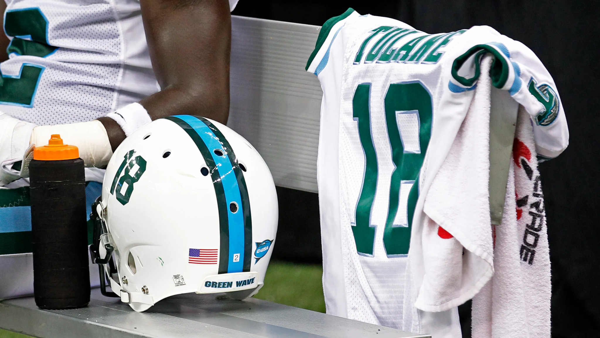
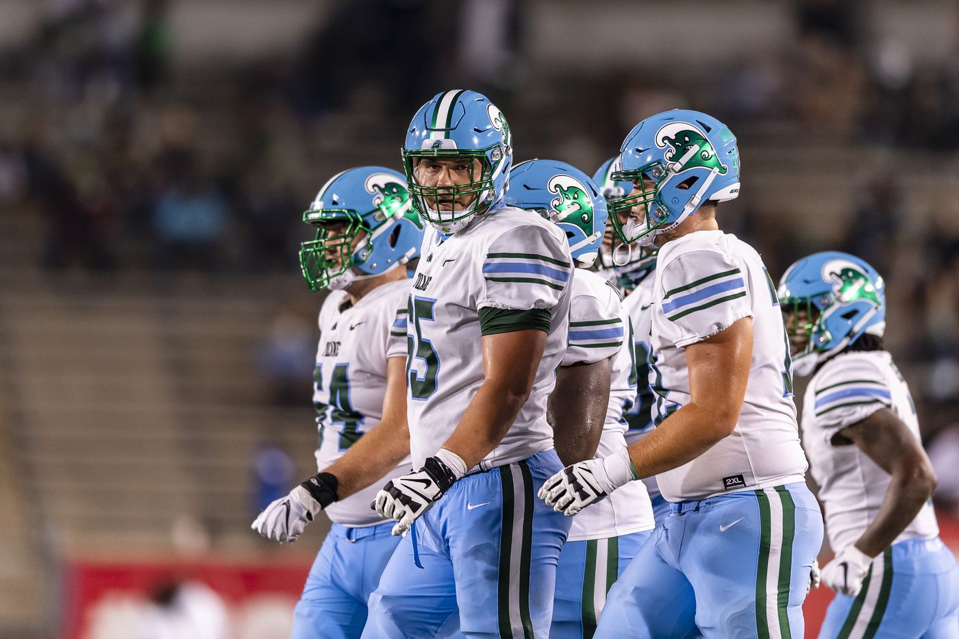
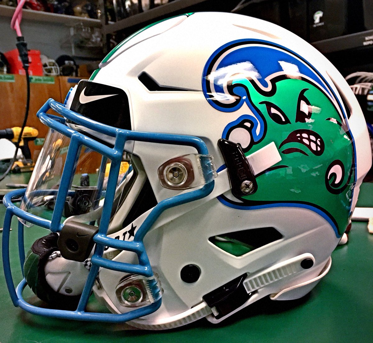
19: Tulane - Revamp
The first full re-brand to make the list. In previous seasons, Tulane have been religiously green and white, with the ‘T’ logo adorning the helmet. Well, it had gone stale, and back in 2020, Tulane were in need of a makeover.
Whoever it was in the room brave enough to suggest The Green Wave changes their primary colour to blue was an absolute GENIUS. The helmets stayed green, but the pants and stripes switched, with green becoming the touch colour instead.
In 2021, Tulane went further, fully migrating to their retro ‘Greenies’ angry wave logo, and alternating their helmets between white and blue. Despite the contradiction with their official nickname, the green decoration really becomes a feature of the uniform – and they can still revert back to their traditional colours when they break out their special all-green ensembles with hollow logo on the helmet. The collection and combos they can make out of their uniform portfolio is now one of the best in college football – and they’ve even showcased some old-school decals too, including the pelican logo from 1920-24, and mascot ‘Greenie’ as pictured above. ROLL WAVE.
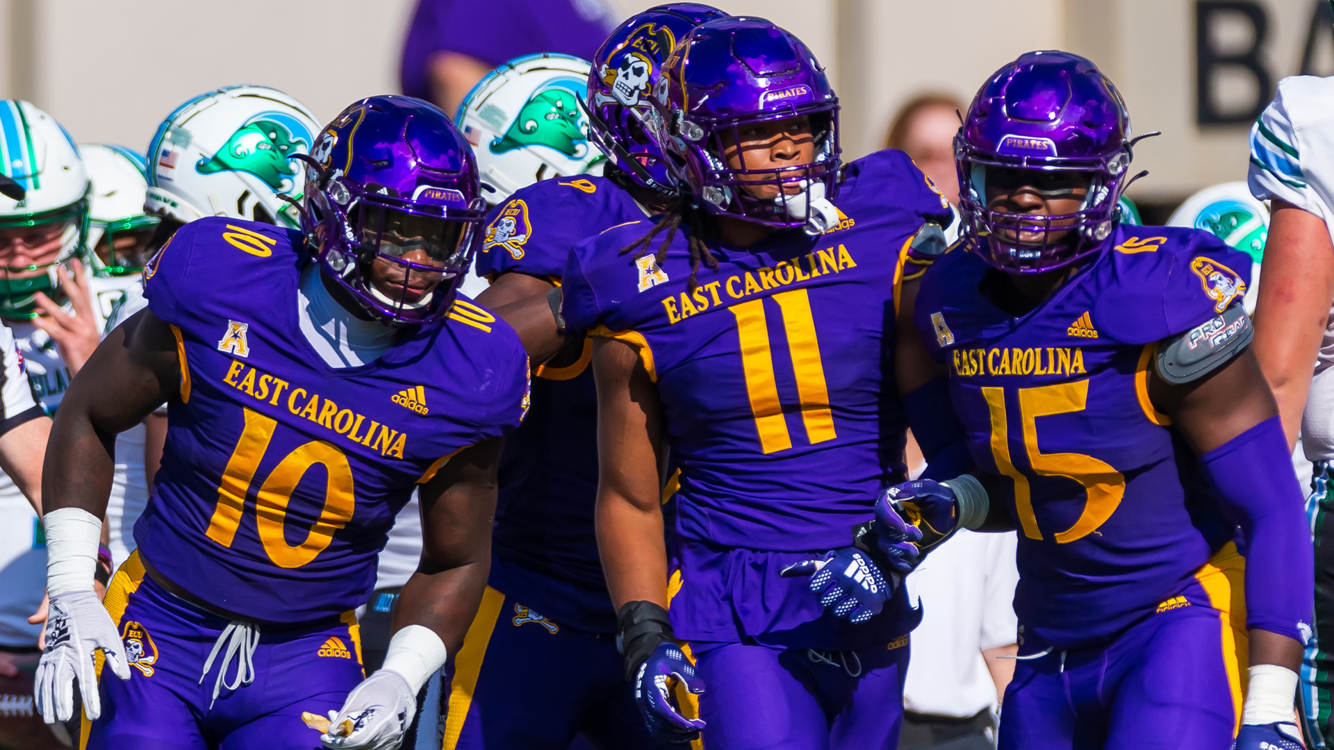
18: East Carolina - Purple Pirates
Some teams like change. Apparently, when ECU penned their deal with Adidas to supply their uniforms, they agreed to have them re-branded every five years to keep them fresh. Whilst the last lot looked like your classic small-school ‘cut and paste, change the colours’ move that the big manufacturers love to revert to when being lazy, The Pirates’ new look is much more iconic…
More teams need to go full colour from top to toe. It creates that colour rush effect that has proven so popular with fans in the NFL, and the deeper purple East Carolina have moved to is almost intimidating. Complement that with a deep yellow-gold for the numbers, nameplates and facemasks, and you’ve given this relatively new program a style that helps them define who they are. Truly swashbuckling!
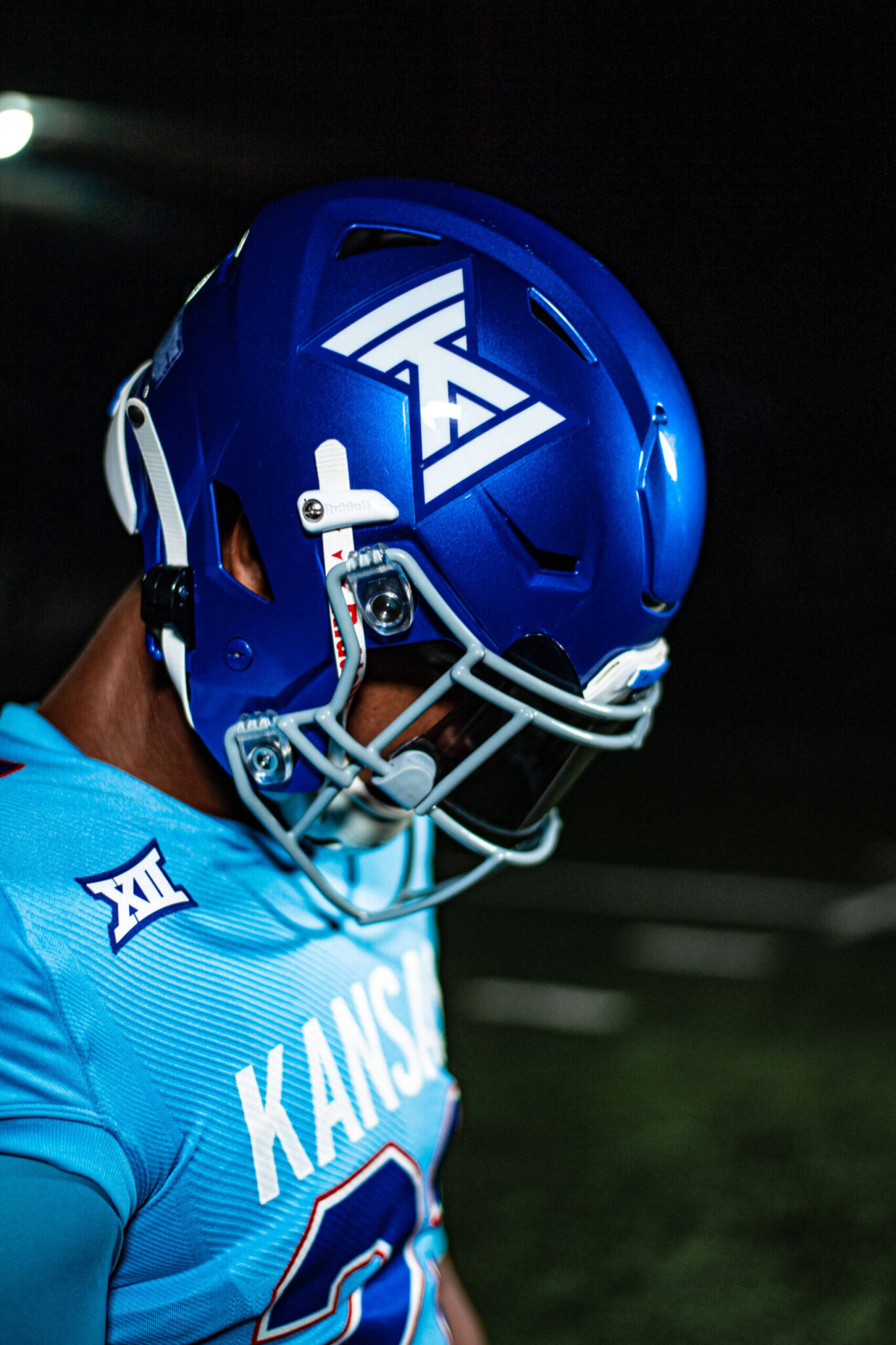
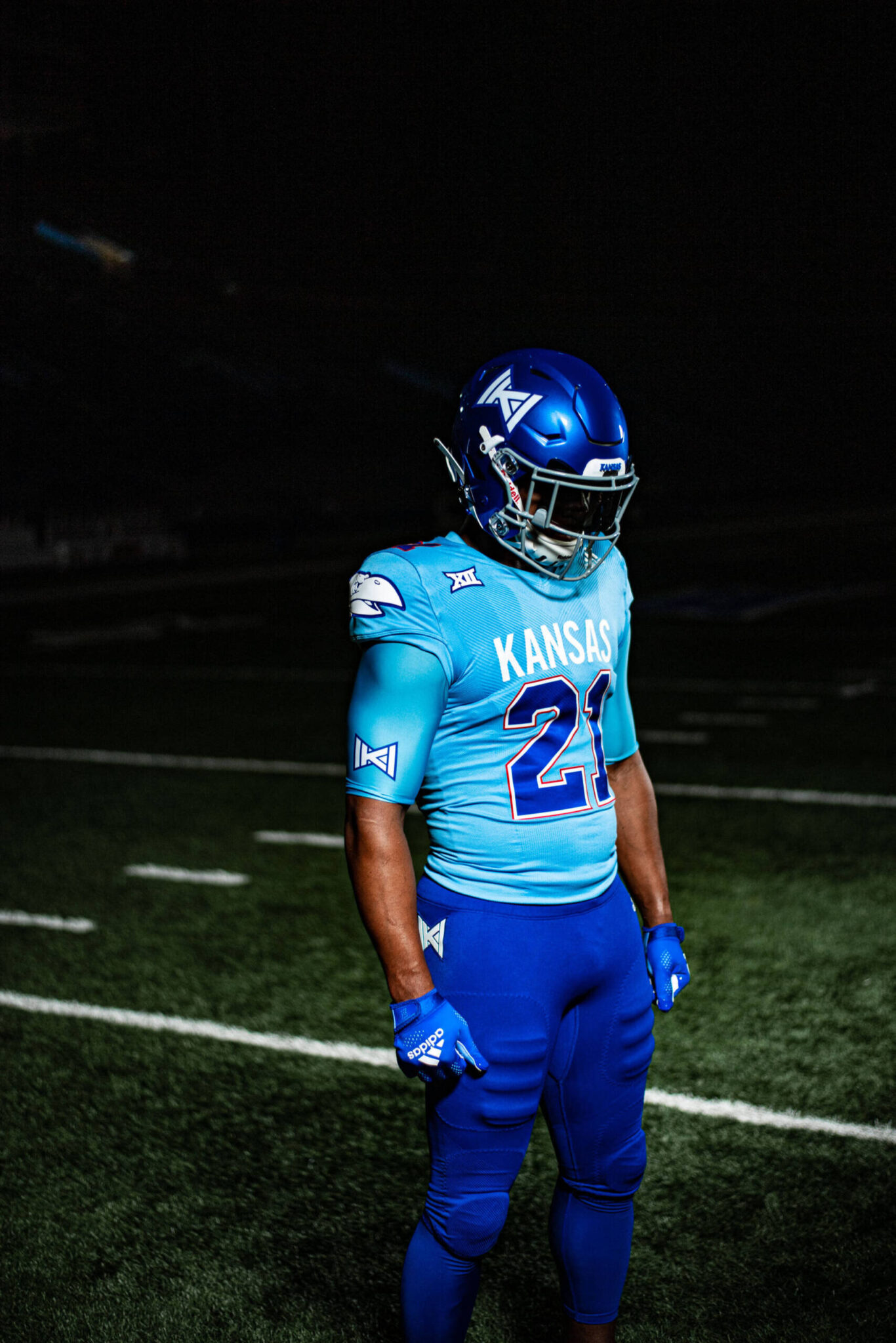
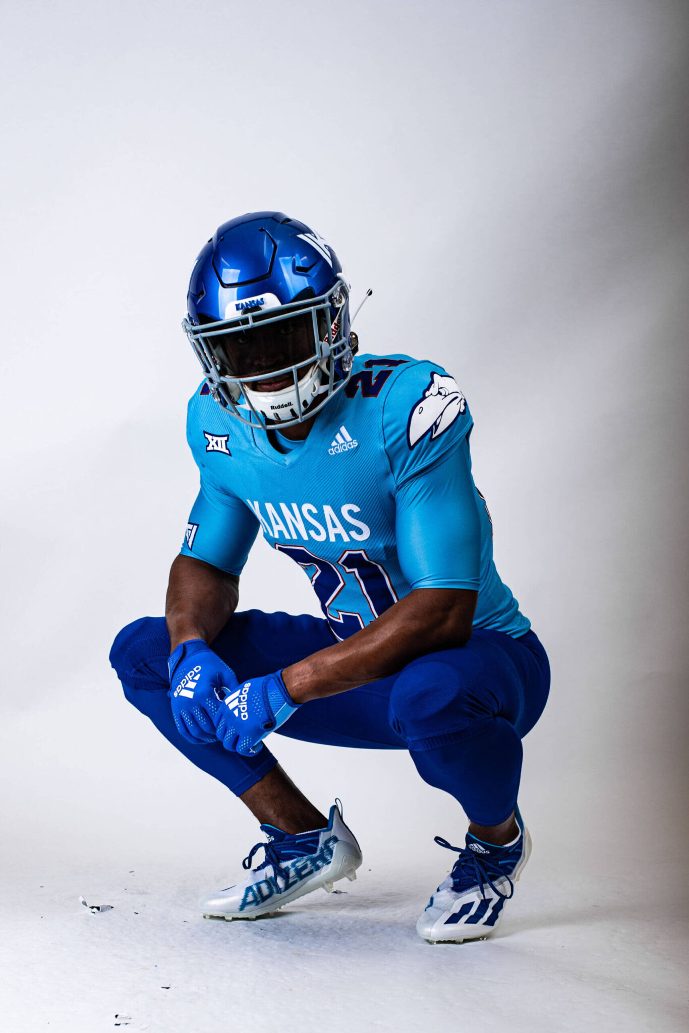
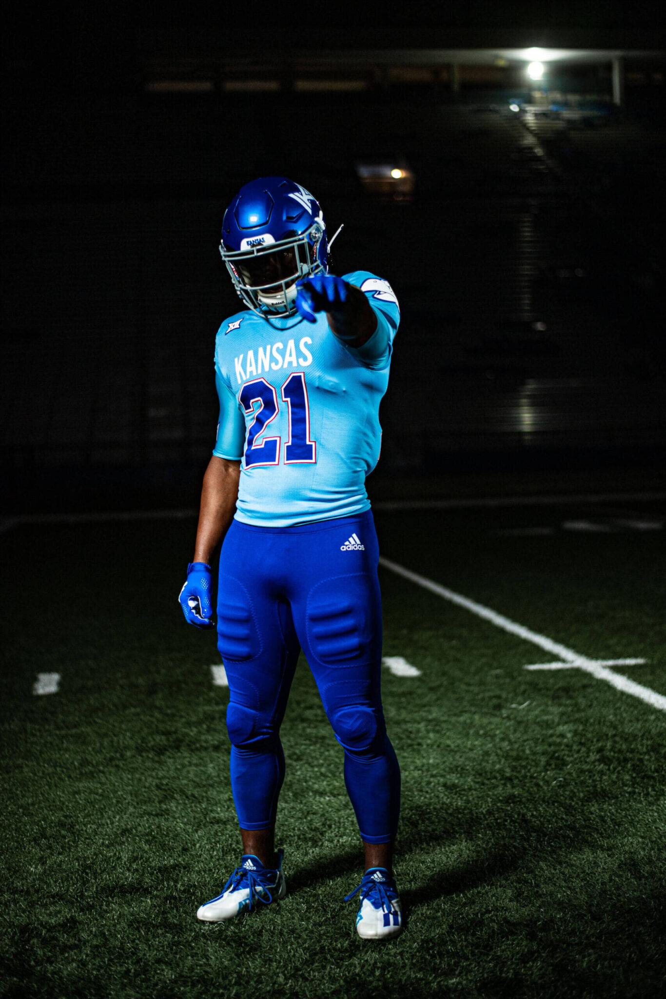
17: Kansas - 'Reverse Retro'
Kansas, as a football program, is a mess. And has been for some time. Unlike other teams in a similar predicament on the gridiron, The Jayhawks have failed to help themselves stylistically either. Despite owning one of the most iconic mascot logos in collegiate sports, I’ve never been able to get on with their traditional uniforms, almost certainly spoiled by their ornate, ‘Times New Roman’ number font.
Well, they’ve played a blinder here. Aided by Adidas’ ‘reverse retro’ range (which other teams have benefited from too), the Jayhawks went back in time to the 1960’s for their Homecoming game against Texas Tech in October. The bird is out and a ‘bowtie’ K logo is in on the helmet, and the colours match those worn by Kansas when Gale Sayers was strutting his stuff in Lawrence. The pièce de résistance however, are the improved numbers and the bold KANSAS emblazoned on the jersey. I can’t promise they’ll play like they had Sayers in the backfield once more, but a permanent move to these bad boys would at least improve the aesthetics for beleaguered Jayhawks fans.
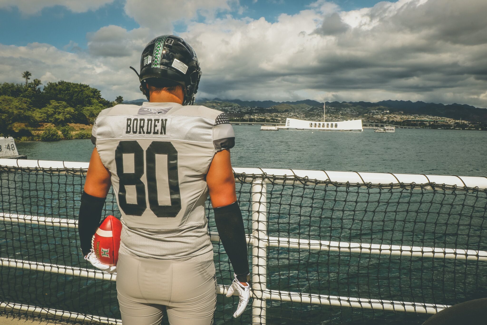
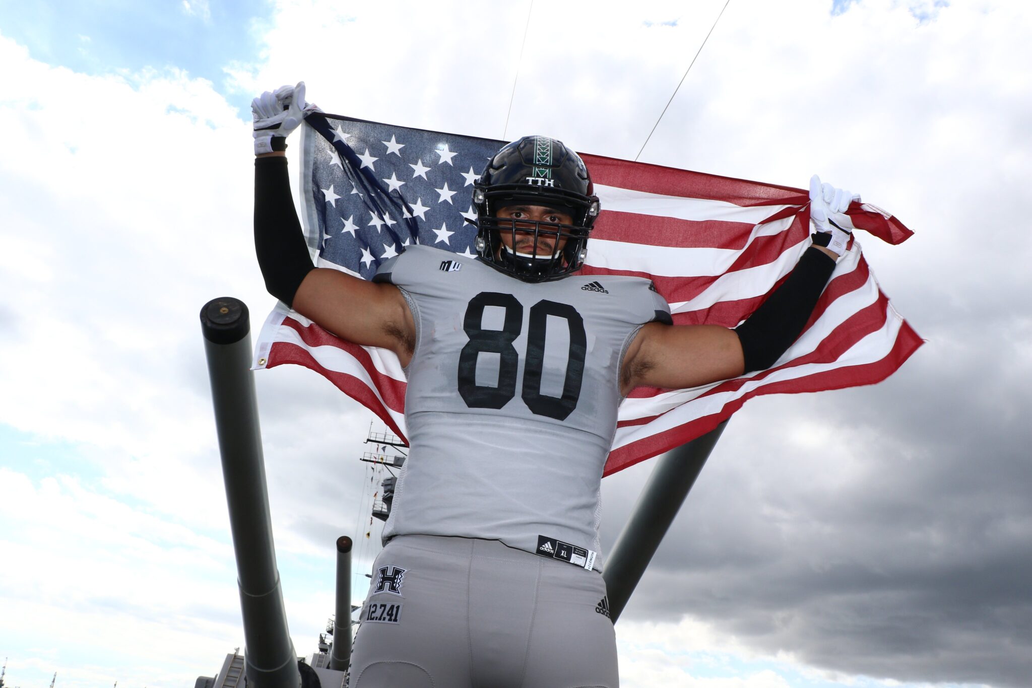
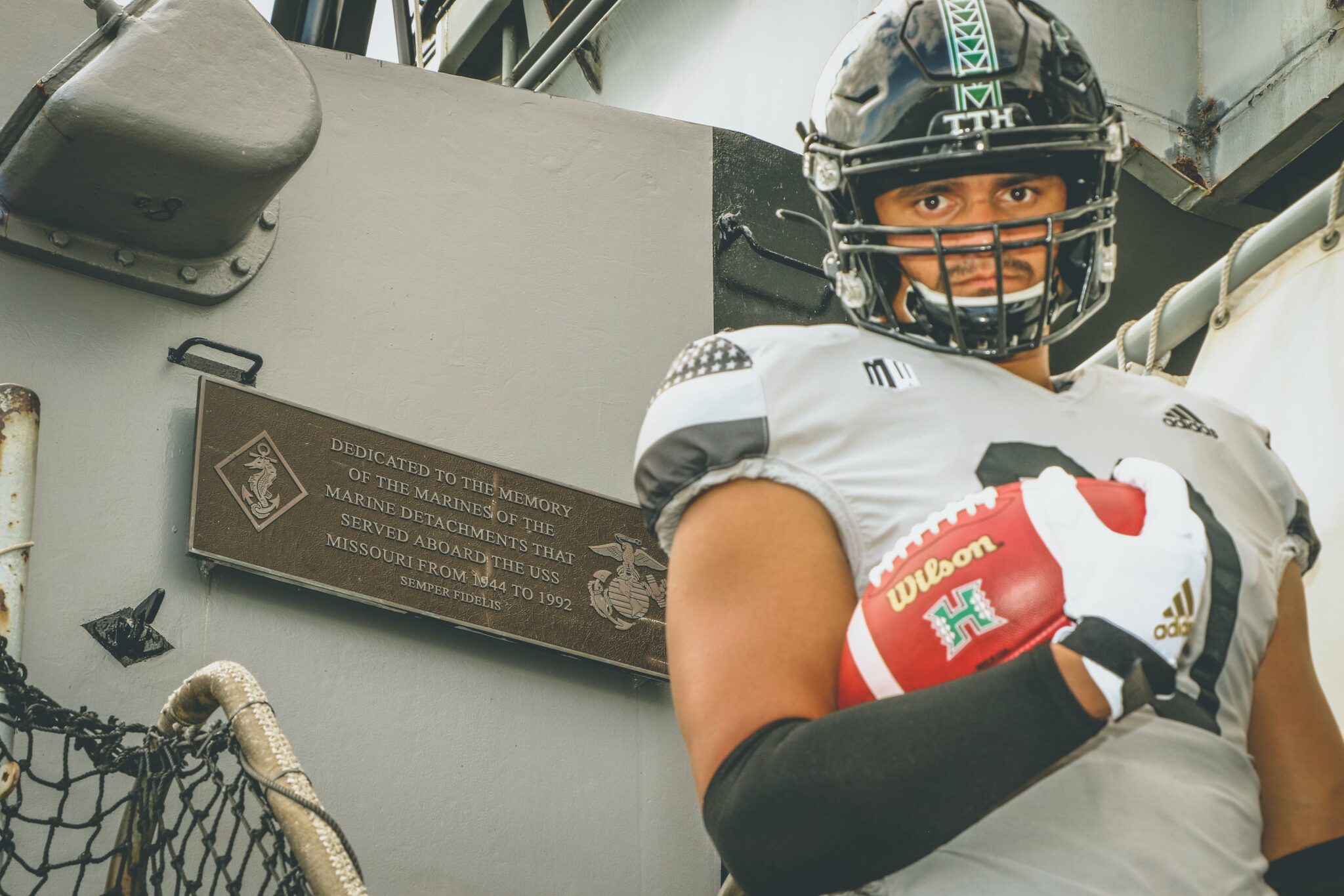
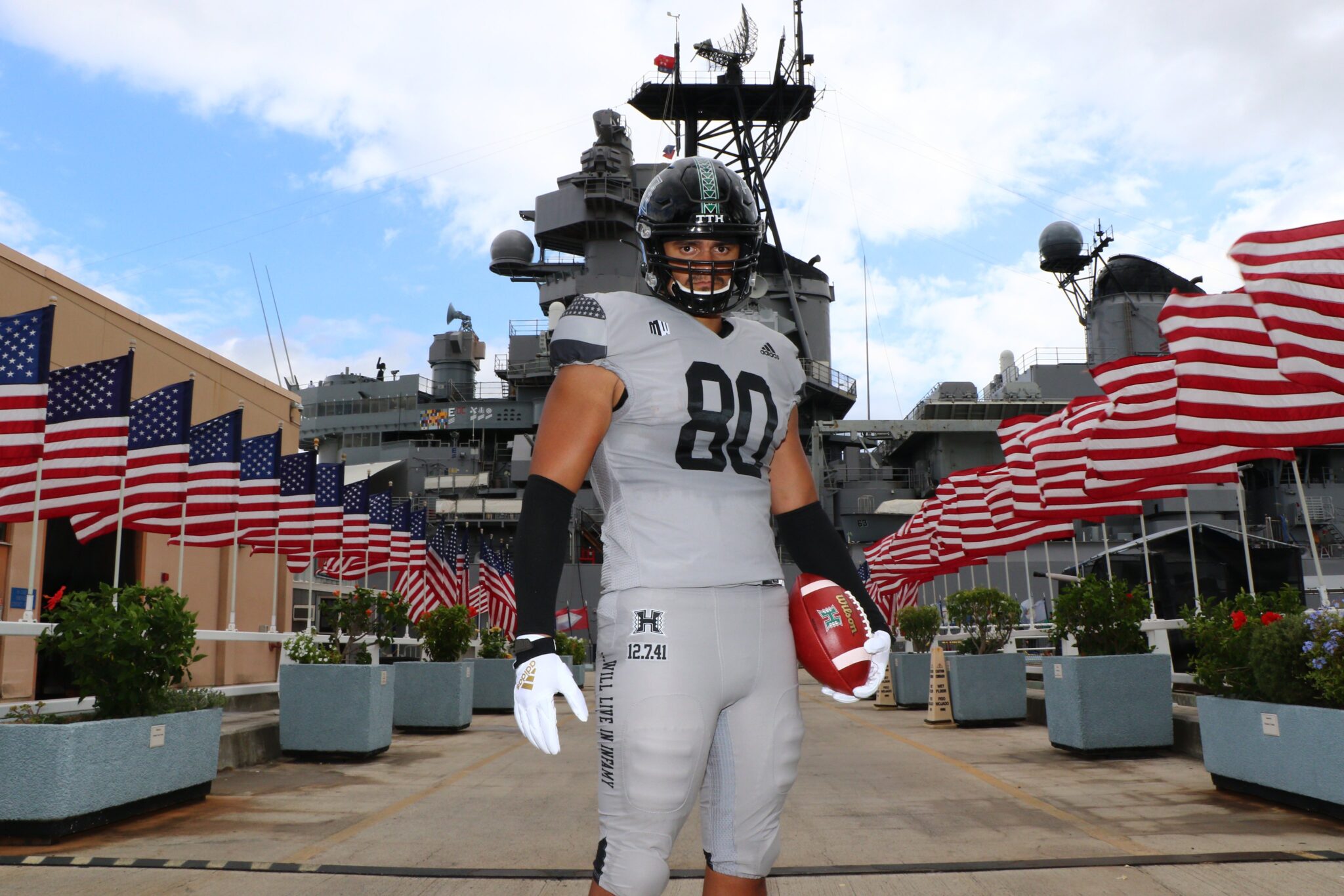
16: Hawaii - 'Battleship Gray'
Another nod to the military here. This was a real cool move by Hawaii, who opted to play in ‘battleship gray’ against San Diego State in November, in acknowledgement of the eightieth anniversary of the attack on Pearl Harbor – as well as recognising their historic team of 1941 that went 8-1, who beat some of the biggest teams in the nation that year.
The day after a huge win against then-powerhouse program Willamette, Hawaii’s players enrolled into the armed forces in response to the events at Pearl Harbour, where 2,403 US personnel lost their lives. Acting as sentries, they were stationed at a nearby high school, tasked with protecting the islands. The grey and black colour scheme was chosen to show reverence to all those affected, whilst the star detail on the shoulders represents unity.
Poignant and stylish. A real touch of class from the Rainbow Warriors.
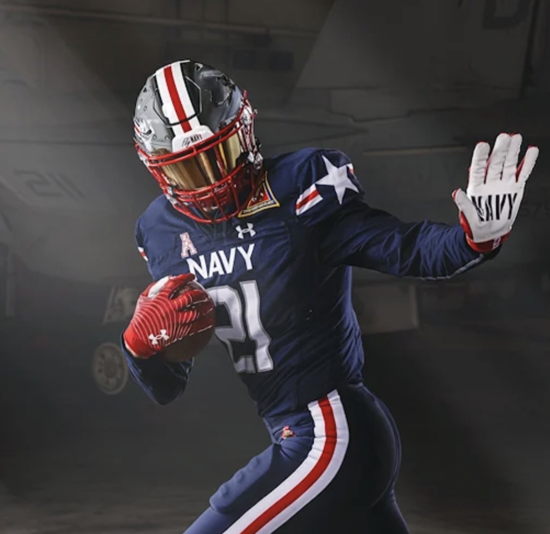
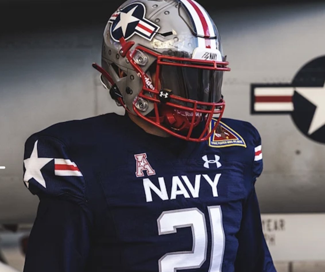
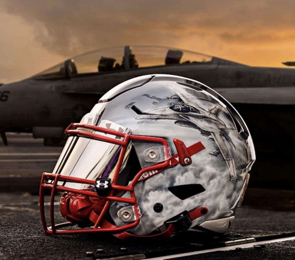
15: Navy - 'F/A-18 Super Hornet'
You might as well make a bed up for Navy in the top-25 uniform hotel. Perennial contenders for best dressed program in the nation, the Midshipmen make this year’s list not once, but TWICE.
First up were these ultra-cool uniforms they sported in the Civil War game to end the college football regular season. The Army-Navy game always kicks out excellent uniform matchups, and last year was no different. The all-navy colours with red and white touch is classically patriotic, and Under Armour ALWAYS delivers on this front. The bold white stars on the cuffs are particularly striking, and the bespoke glove palms a delicate touch.
But the helmet undoubtedly steals the show. Every single lid was hand painted. Every single one! The left side of each helmet depicts an F/A-18 Super Hornet, the ‘backbone of Navy tactical operations since it entered operational use in 1999, replacing the F-14 Tomcat’. The right side shows the roundel, the traditional symbol of navy aviation.
The uniform helped inspire the Midshipmen to a shock 17-13 win over Army last December. And if all that isn’t cool enough? The Super Hornet is able to take direct hits from surface to air missiles, and be repaired and ready to fly the next day. Beat Navy? No chance.
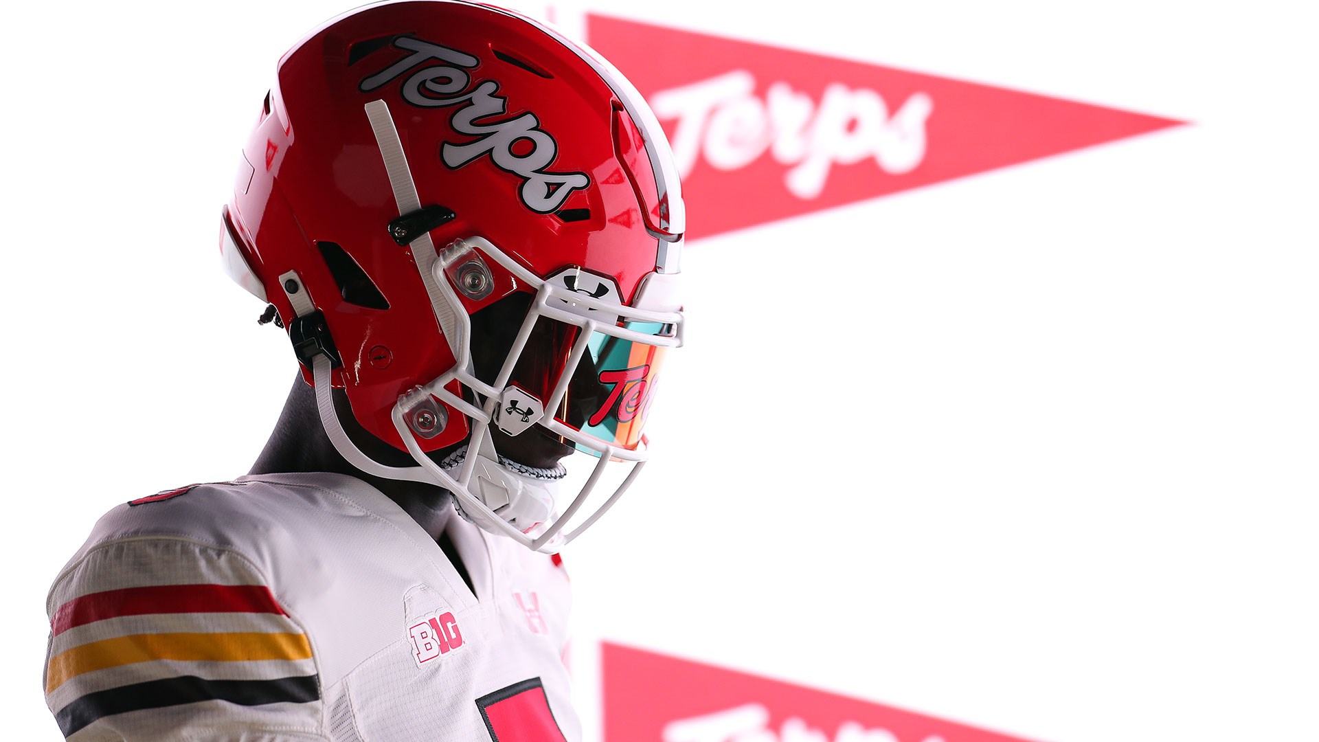
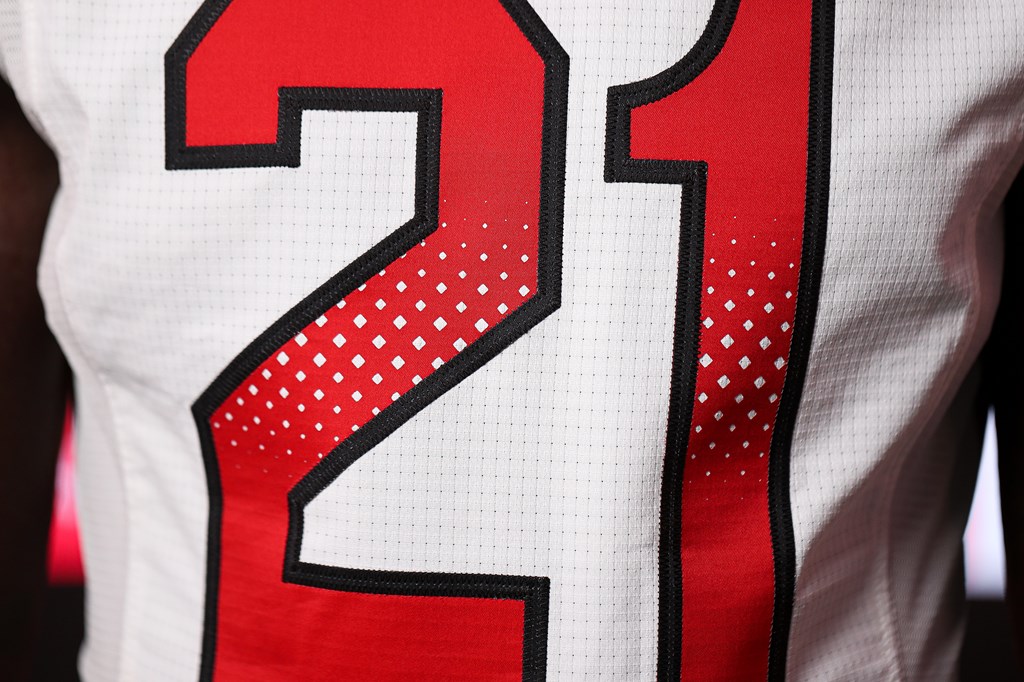
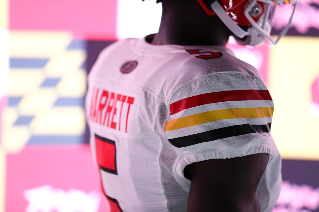
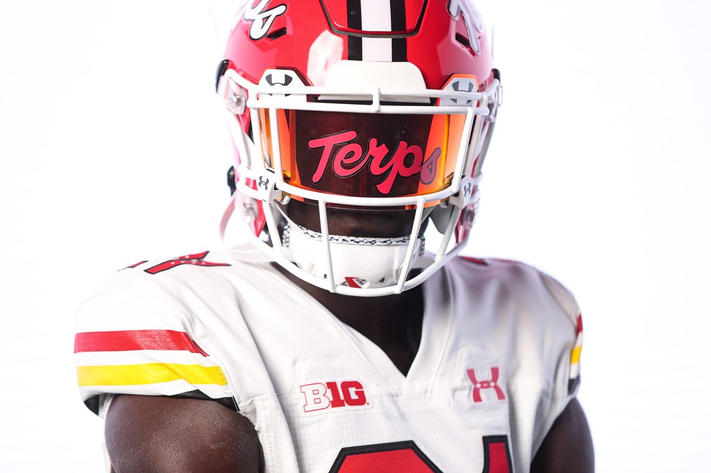
14: Maryland - 'White Terps Script'
When you think of Under Armour and college football, you immediately think Maryland. As Oregon is to Nike, The Terrapins are to UA – tied to the hip and nationally recognised as permanent partners. Since their partnership began in 1997, Maryland has been at the forefront of uniform evolution, being one of the first programs in particular to embrace more detailed styles, and adopting themes to their fashion, such as the Maryland flag.
To celebrate their 25 year partnership, Under Armour released a throwback jersey to commemorate the uniforms The Terps wore in the 80’s. 2020 saw a red retro release, but in my opinion the white one is much more powerful, with the three stripes in classic Maryland colours on the arm simple but very effective. The UA effect can still be seen in the numbers, but the spotty detail in the middle even harks back memories of printed numerals that have perforated with the mesh behind it after one too many wash cycles. It’s a delicate dose of nostalgia from a company that usually goes big and bold – and I think they’ve absolutely nailed it.
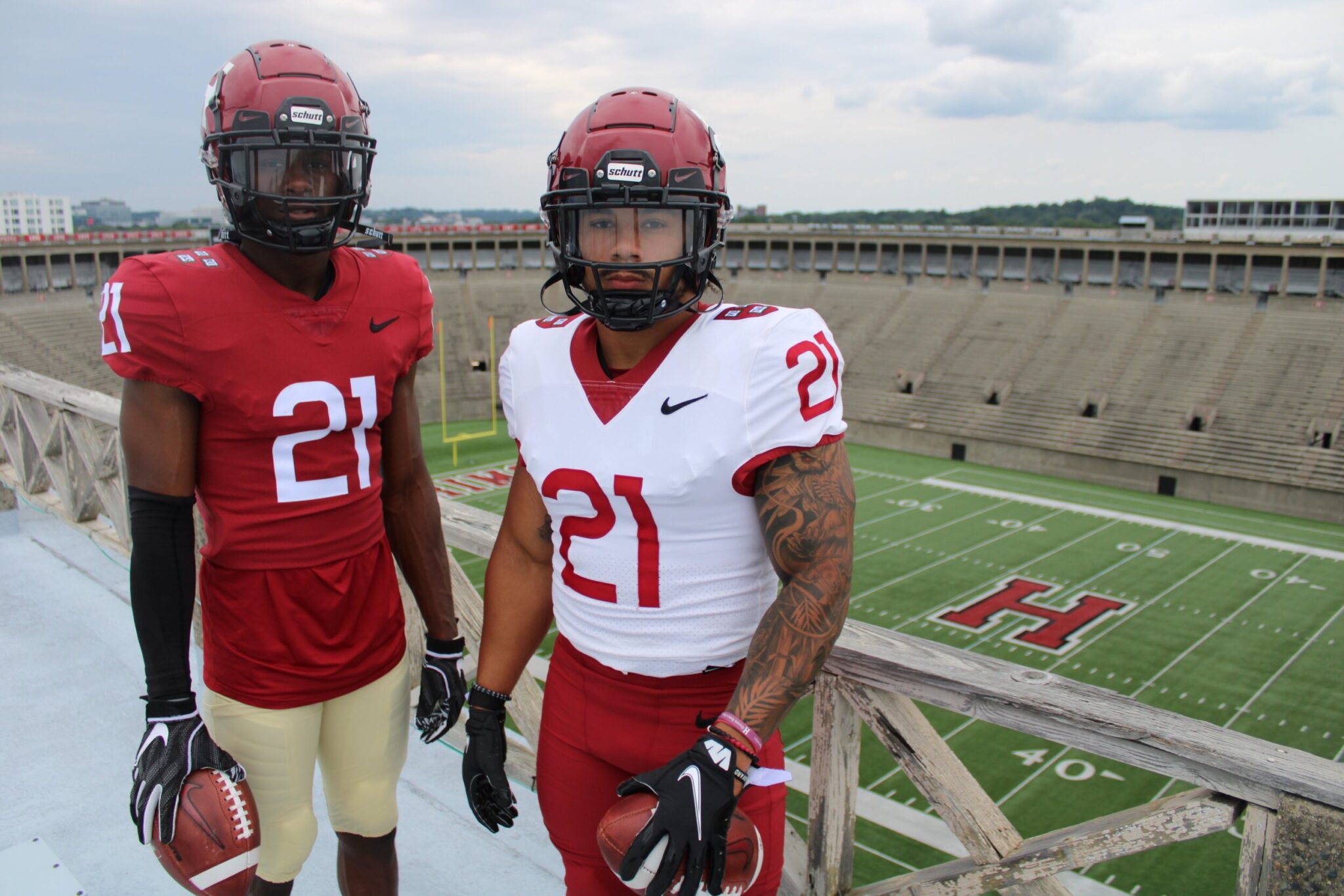
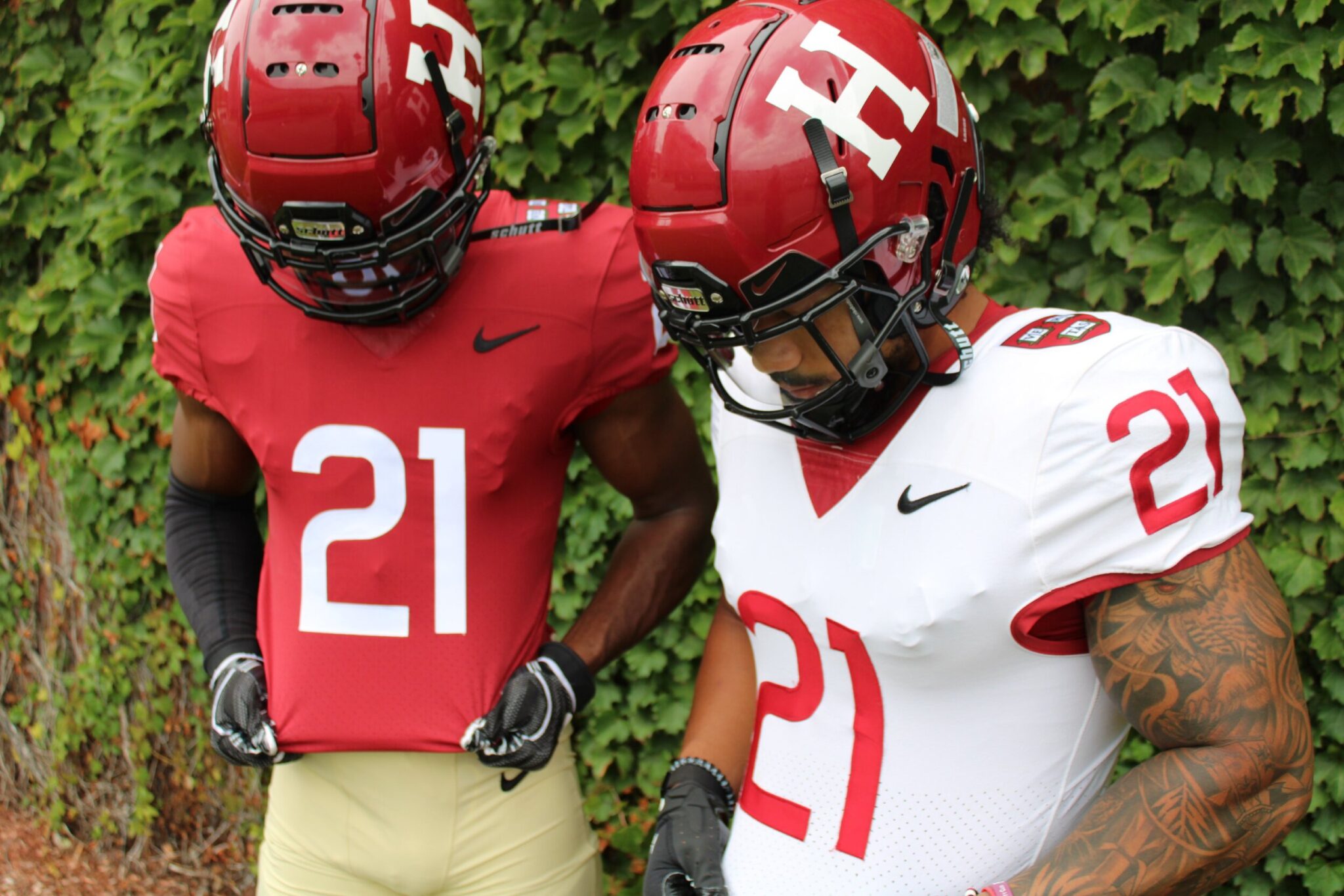
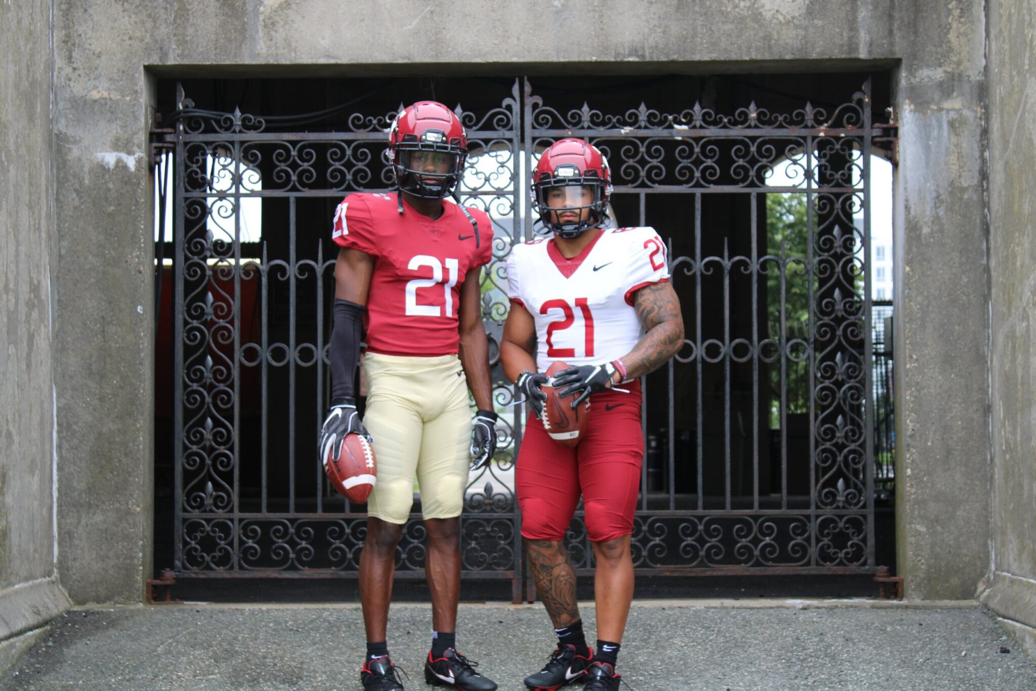
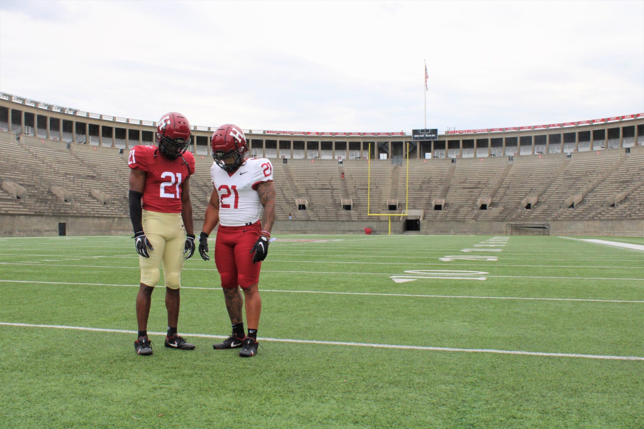
13: Harvard - 'Classic & Clean'
Oh yes.
The only non FBS school to make the top 25, Harvard get a special mention for these bad boy uniforms. In a complete juxtaposition to the usual creations that adorn these lists, Harvard instructed Nike to go back to basics and deliver a truly retro vibe with their full on re-brand.
The results are almost perfect – almost – with undersized numbers on the jerseys and no nameplates at all. The ‘oatmeal’ pants complement the home jersey nicely, and the bold H on the slightly darker red helmet still gives you those classic vibes of the imperious academic institution this football team represents. The only thing I’m not keen on is the black Nike tick – i’d prefer it not to be on there at all, but if they do insist on adorning the jersey, have it the same colour as the numbers! Regardless, a solid effort. Clean, classic, Crimson.
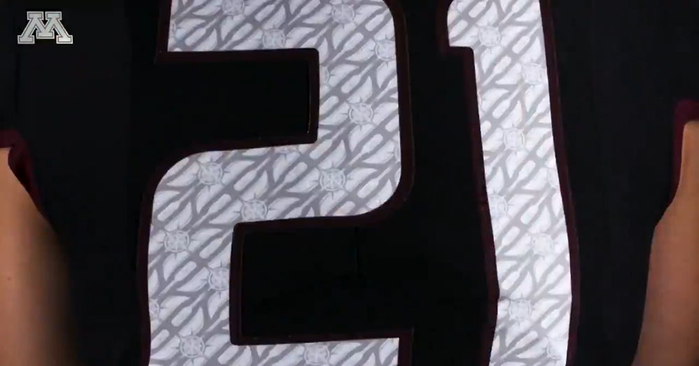
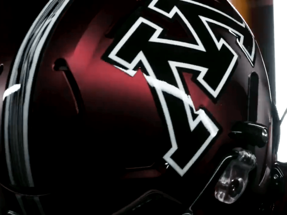
12: Minnesota - 'Blackout'
A lot of teams are knocking out all-black speciality uniforms these days, and many of them are worthy of recognition. But to keep this article diverse, I’ve restricted myself to just two to make the list. First up is Minnesota, whose blackout creation is something truly special. Marrying a deep burgundy helmet and touch with jet black jerseys and the Classic ‘M’ decal, the Gophers were a formidable sight as they stepped onto the field against Ohio State last year.
The best bit about this uniform are the numbers. Embedded into the white digits are circles made up of canoes, oars and compasses, a nod to PJ Fleck’s ‘row the boat’ mantra. I’m not sure there’s one individual aspect of any jersey on this list cooler than that. Sadly, The Buckeyes weren’t initimidated by the strong look and managed to win 45-31. But expect this uniform to return very soon…
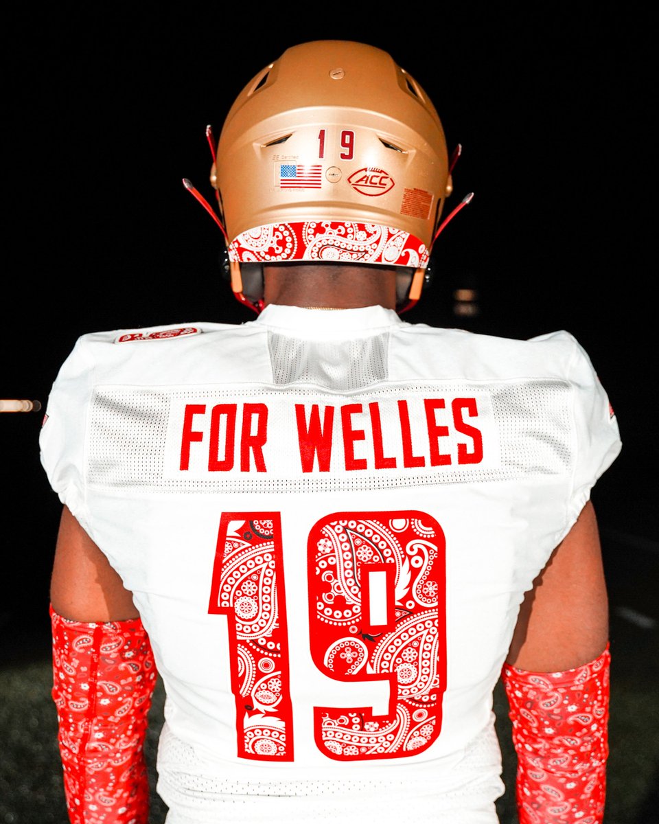
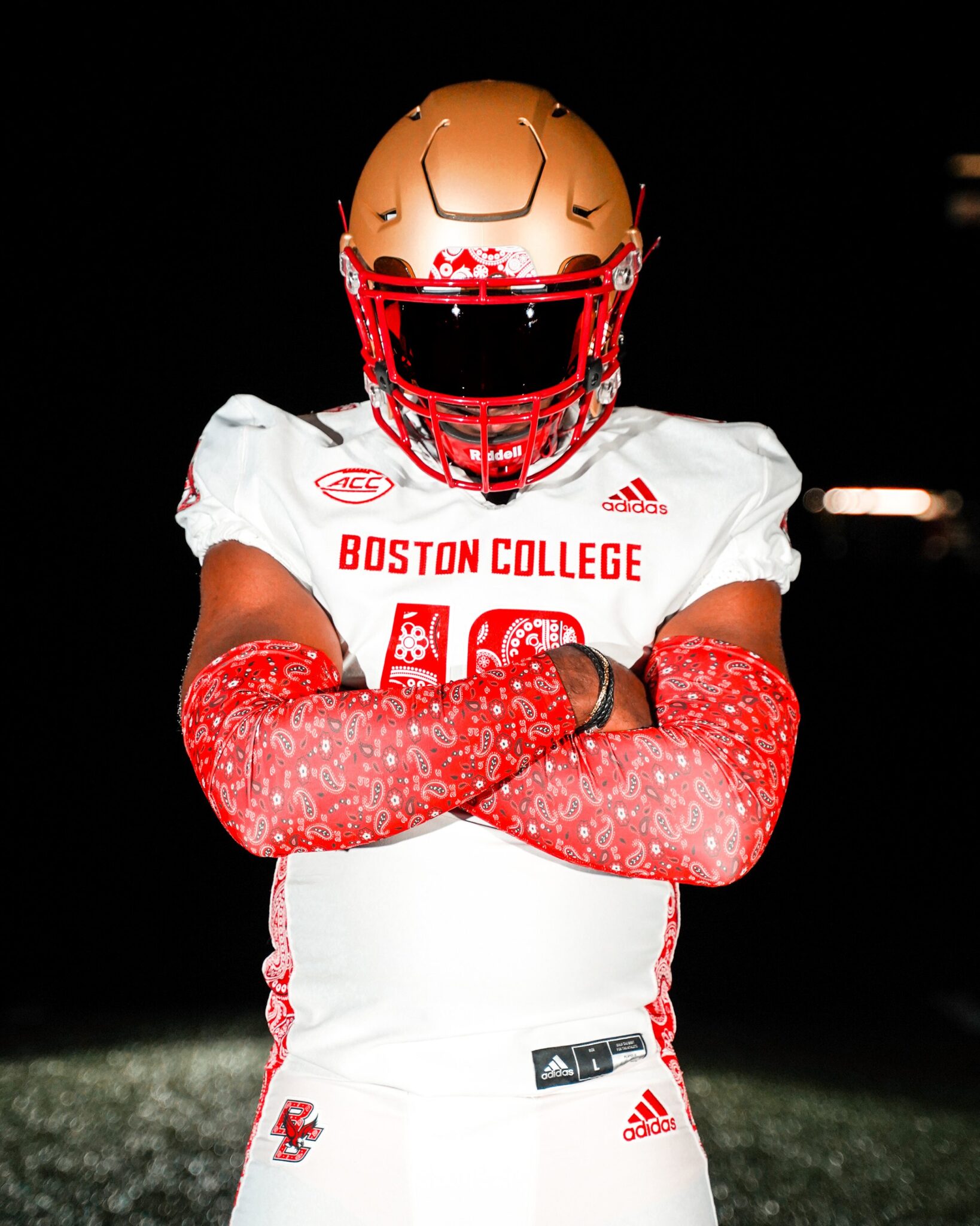
11: Boston College - 'Red Bandana'
Those familiar with the story of Welles Crowther will be fully aware of what the Boston College ‘red bandana’ game represents each year. A former BC alumni, Crowther lost his life in the terrorist attacks of 9/11 when rescuing people stuck in the south tower of the World Trade Center. The hero saved eighteen lives that fateful day before perishing himself, and those that owe him their lives fondly remember him as ‘the man with the red bandana’, which he used around his face to reduce the smoke inhalation.
To honour Crowther, The Eagles have worn special uniforms for their yearly Red Bandana game since 2014. Last season marked the twentieth anniversary of the attack, and it was the first opportunity Adidas had to pick up the baton from Under Armour and continue the tradition. They didn’t let themselves down, with the iconic red paisley design gracing the side panels of the jersey, as well as the numbers, arm sleeves and back of the helmet. The perfect tribute to commemorate a fallen brother.
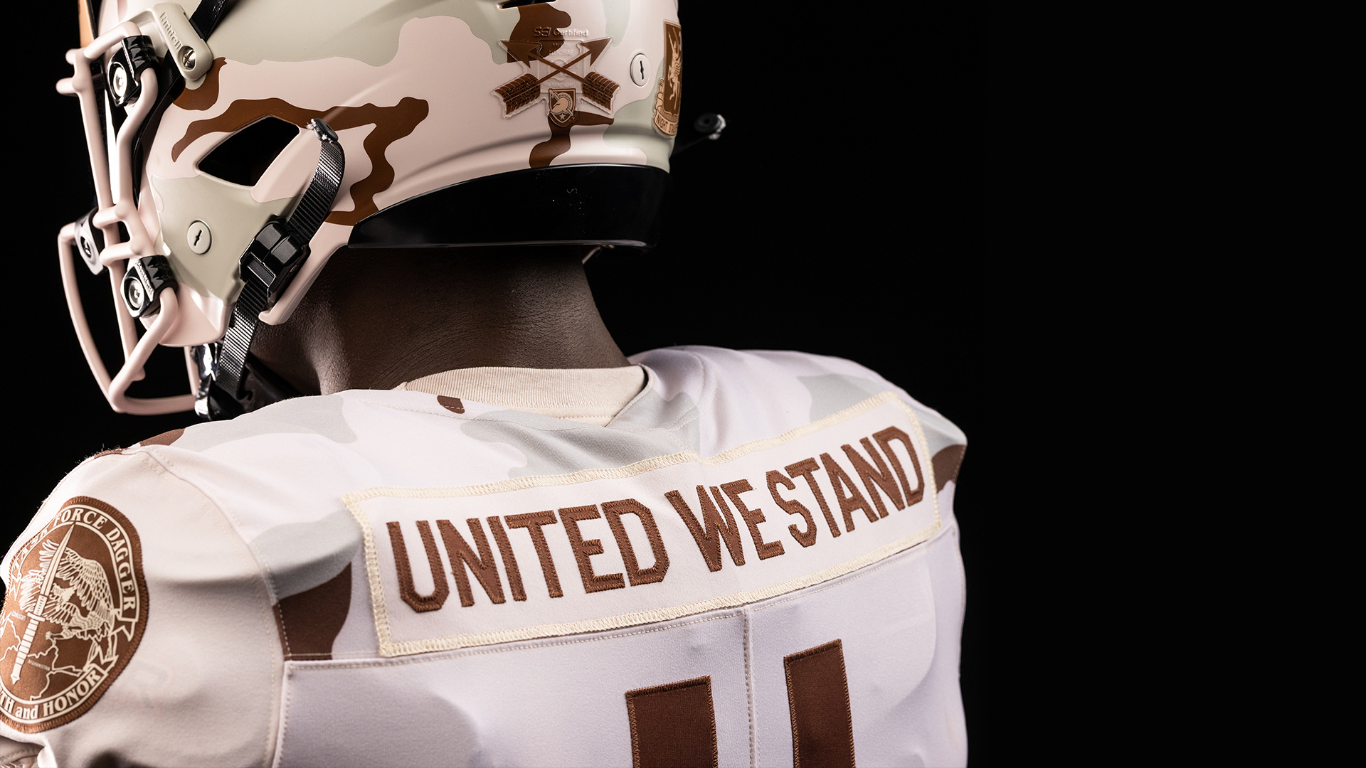
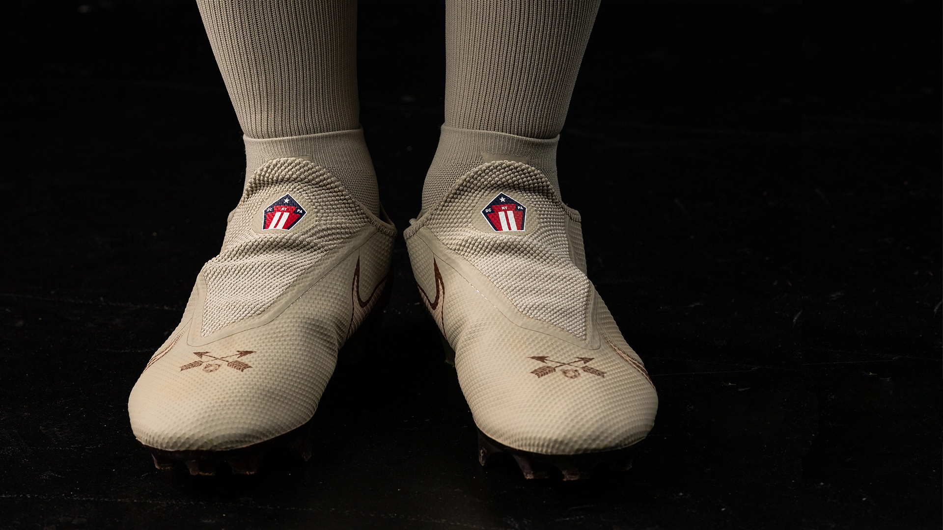
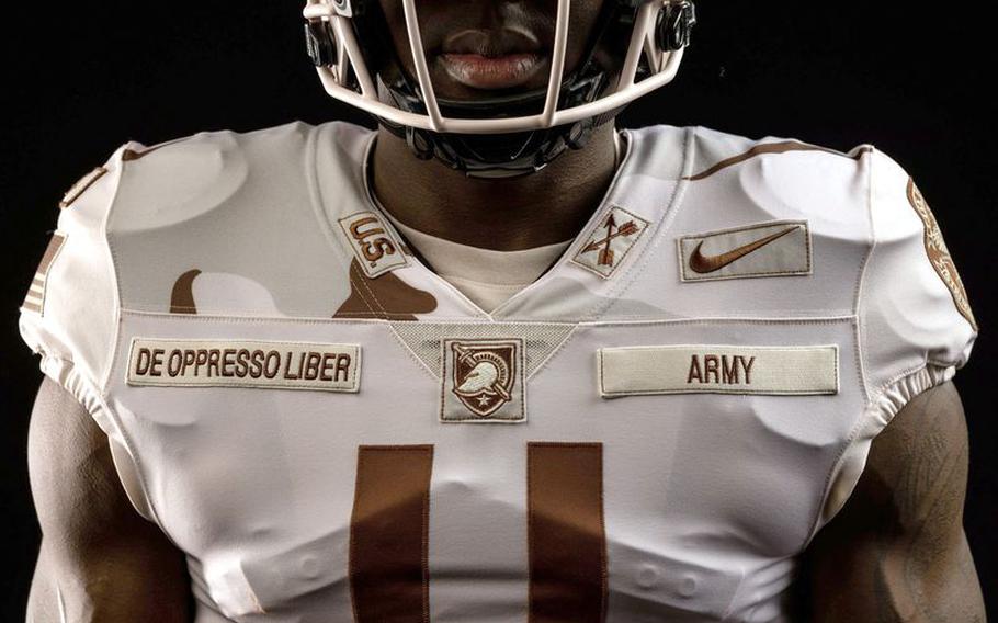
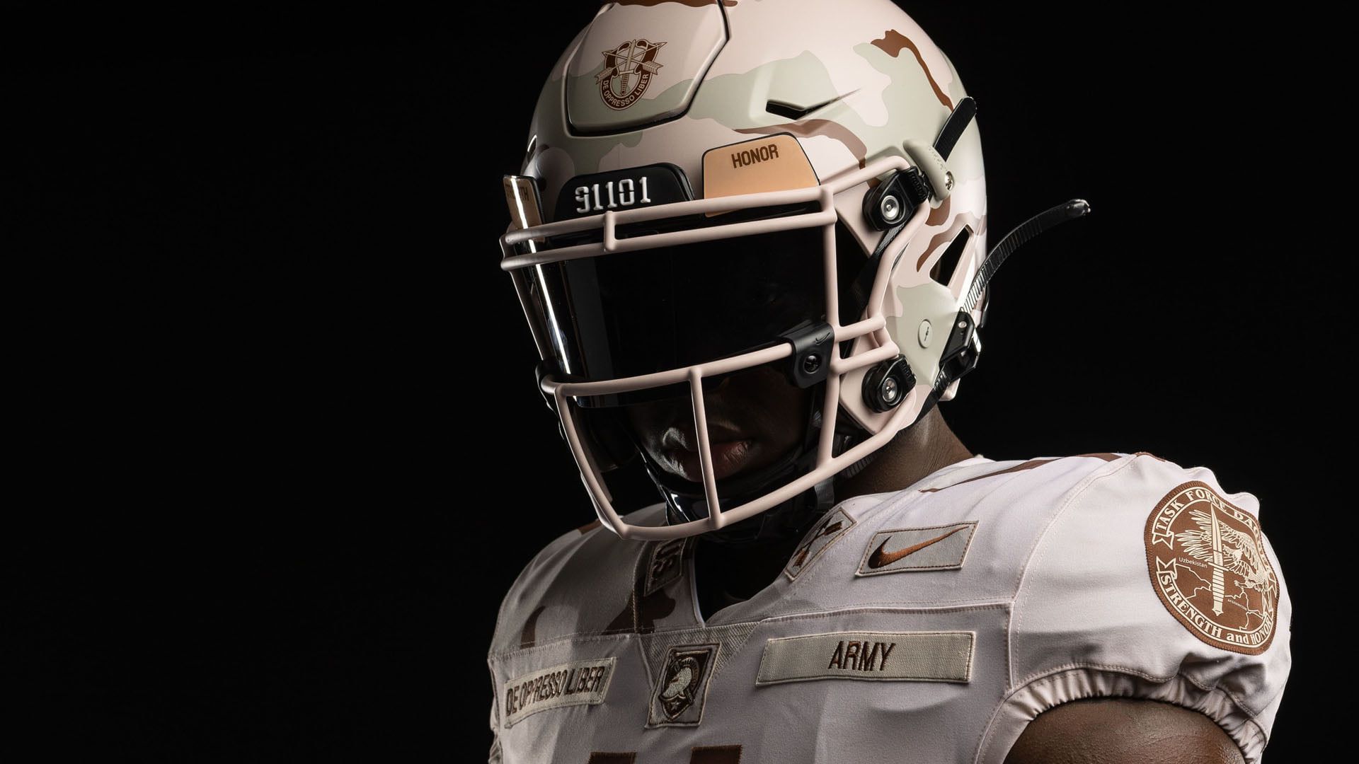
10: Army - 'Special Forces ODA's'
In a fitting pivot, our next entry in the top twenty five sees a uniform borne from the reaction to the terrorist attacks of 9/11. Army are no slouches when it comes to delivering their own speciality uniforms for the Civil War, and donned these bad boys against Navy in December…
First off, brown is an underrated colour. And it really sings when sat on top of a white background, which is what the Black Knights did here. Honoring the army members of ‘Task Force Dagger’ – the first assault of Afghanistan as part of Operation Enduring Freedom – the uniforms remember the army green beret teams that made up the Operational Detachment Alphas (ODA’s). The ODA’s involved in Task Force Dagger were 534, 555, 574 and 595, whose numbers were emblazoned into the shoulders of the jersey. In classic service academy fashion, the nameplates were replaced with a message, and the latin on the front – ‘De Oppresso Liber – translates to ‘to free the opporessed’.
The hint of camouflage on the helmet is the perfect finishing touch. Nike did these boys proud.
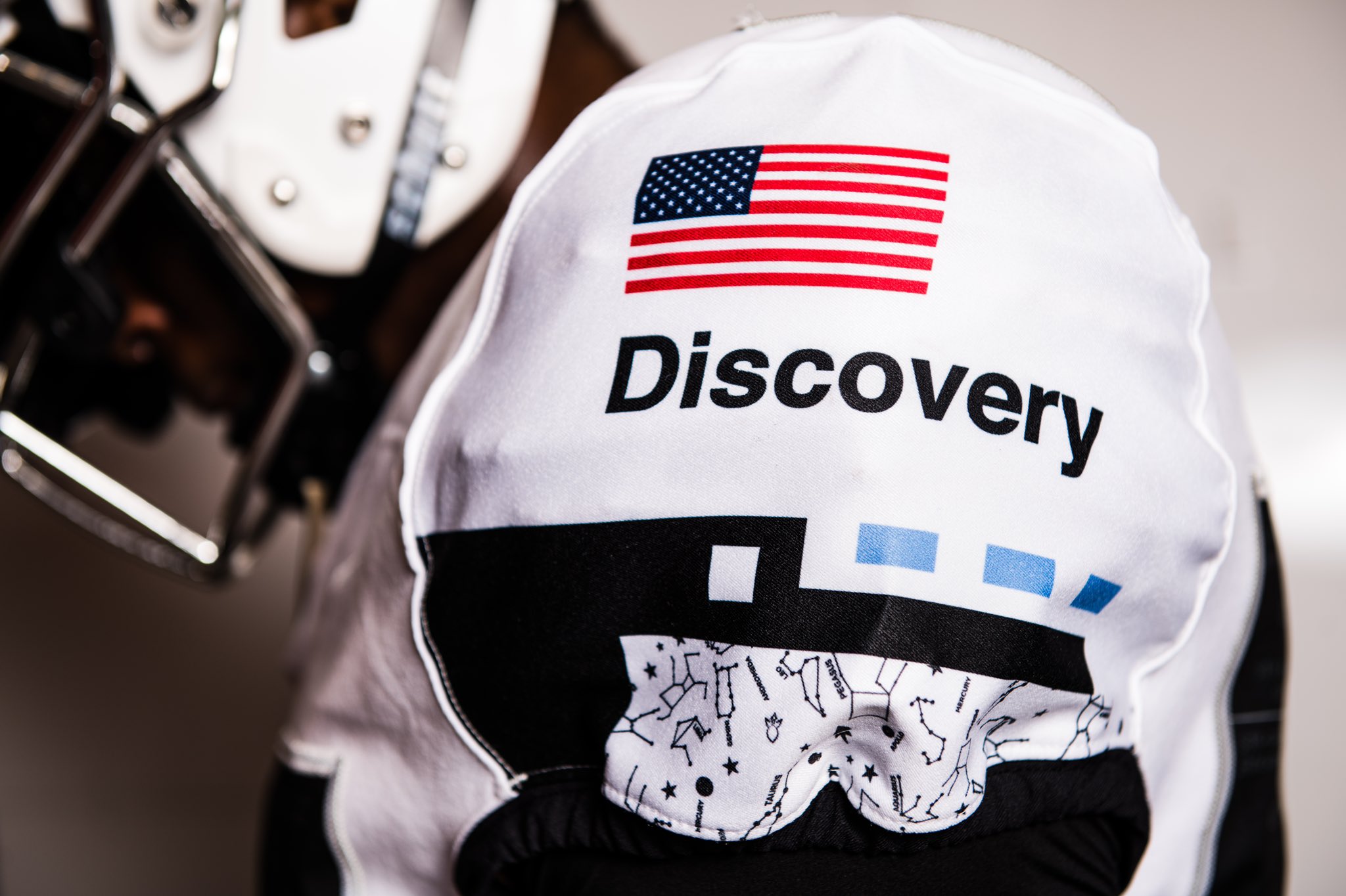
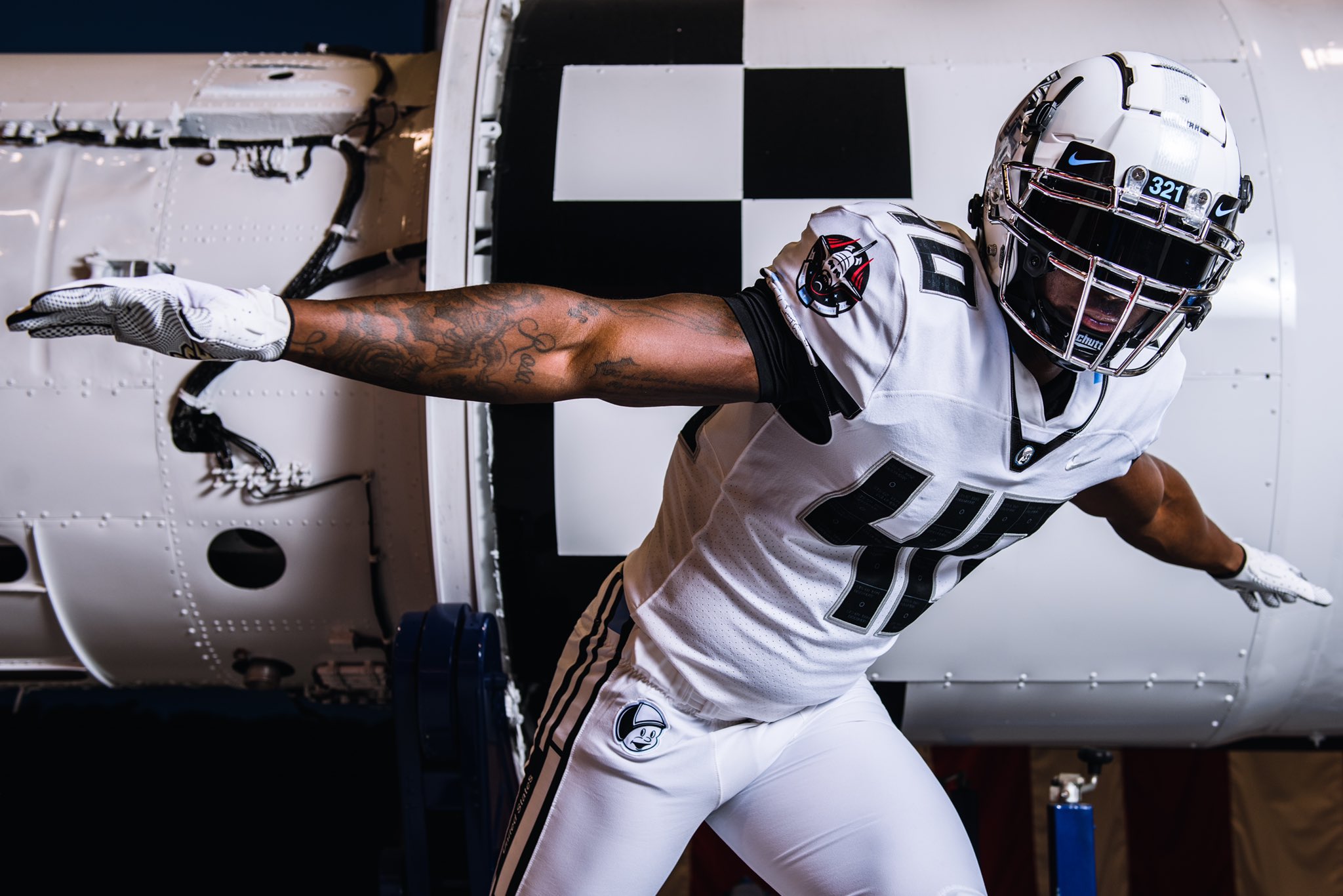
9: UCF - 'Space Game'
Buckle up people – there’s a lot to get to with these ‘out of this world’ uni’s from UCF…
Whilst most teams inevitably turn to the military with their honorary outfits, Central Florida went in a different direction. 2021 saw the 40th anniversary of the space shuttle program, and to pay tribute this is what Orlando came up with. There is an extraordinary amount of detail in the jerseys, with small tiles in the numbers that represent the thermal protection tiles of the shuttle, a nod to the Discovery shuttle on the left sleeve, and the mission patch on the right. Apparently the collar is designed to look like the nose of a rocket – i’ll take their word for it, but there’s no denying the overall effect is impressive.
The coolest aspect of this uniform was the nameplates, which perfectly depict those on the space suits used at the international space station. Sadly, the look couldn’t take them to greater heights as UCF became another victim of Cincinnati’s march to the playoffs. Nevertheless, the team looked interstellar.
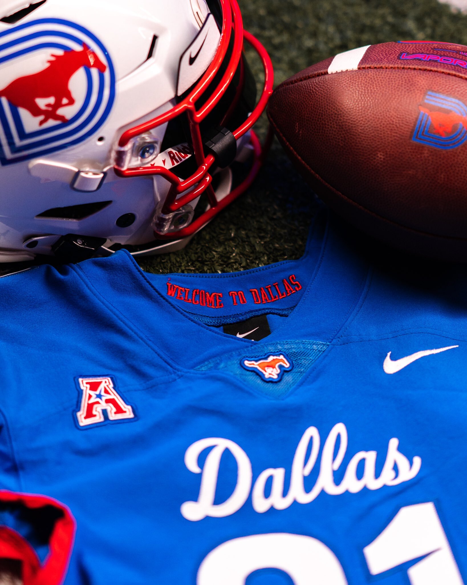
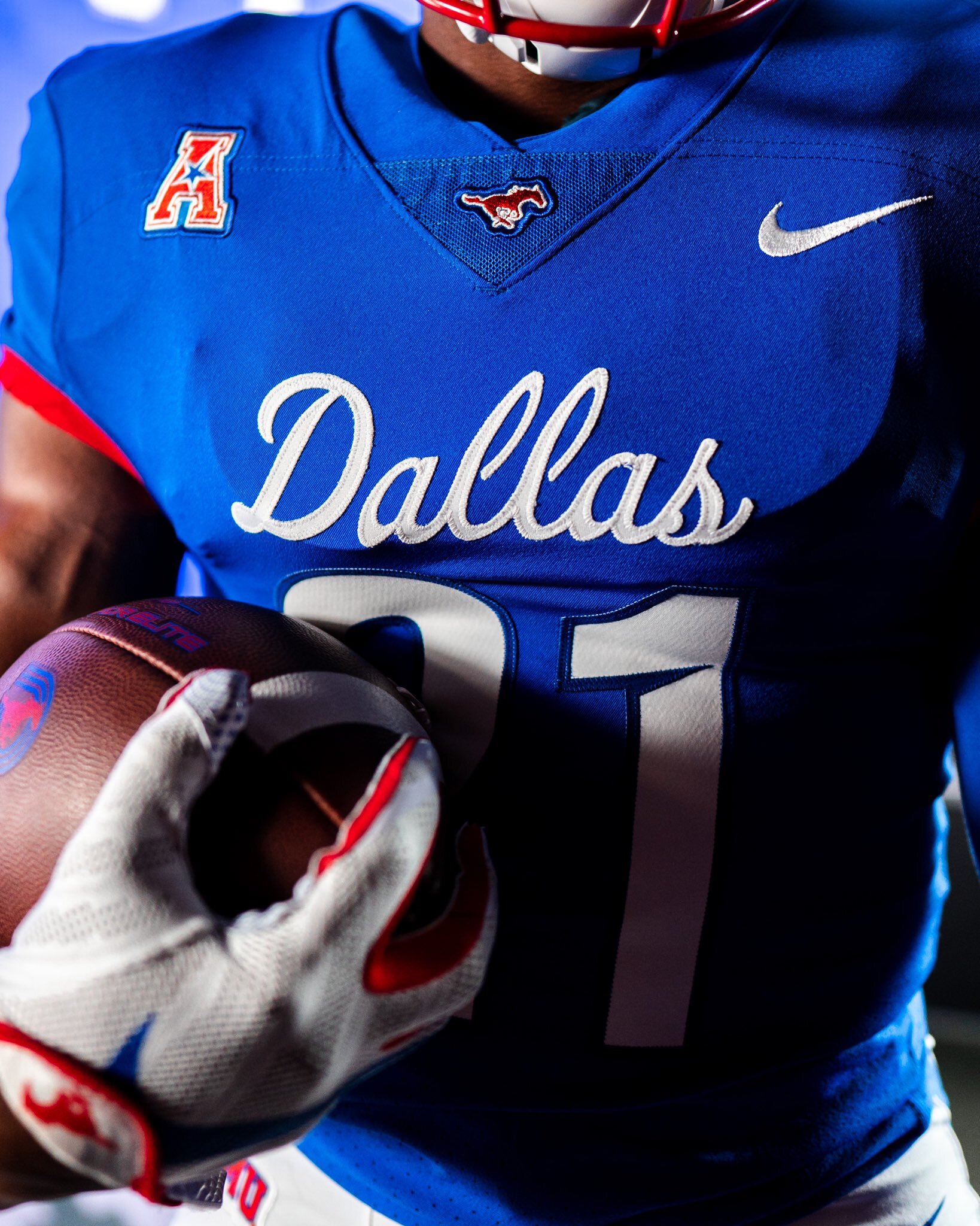
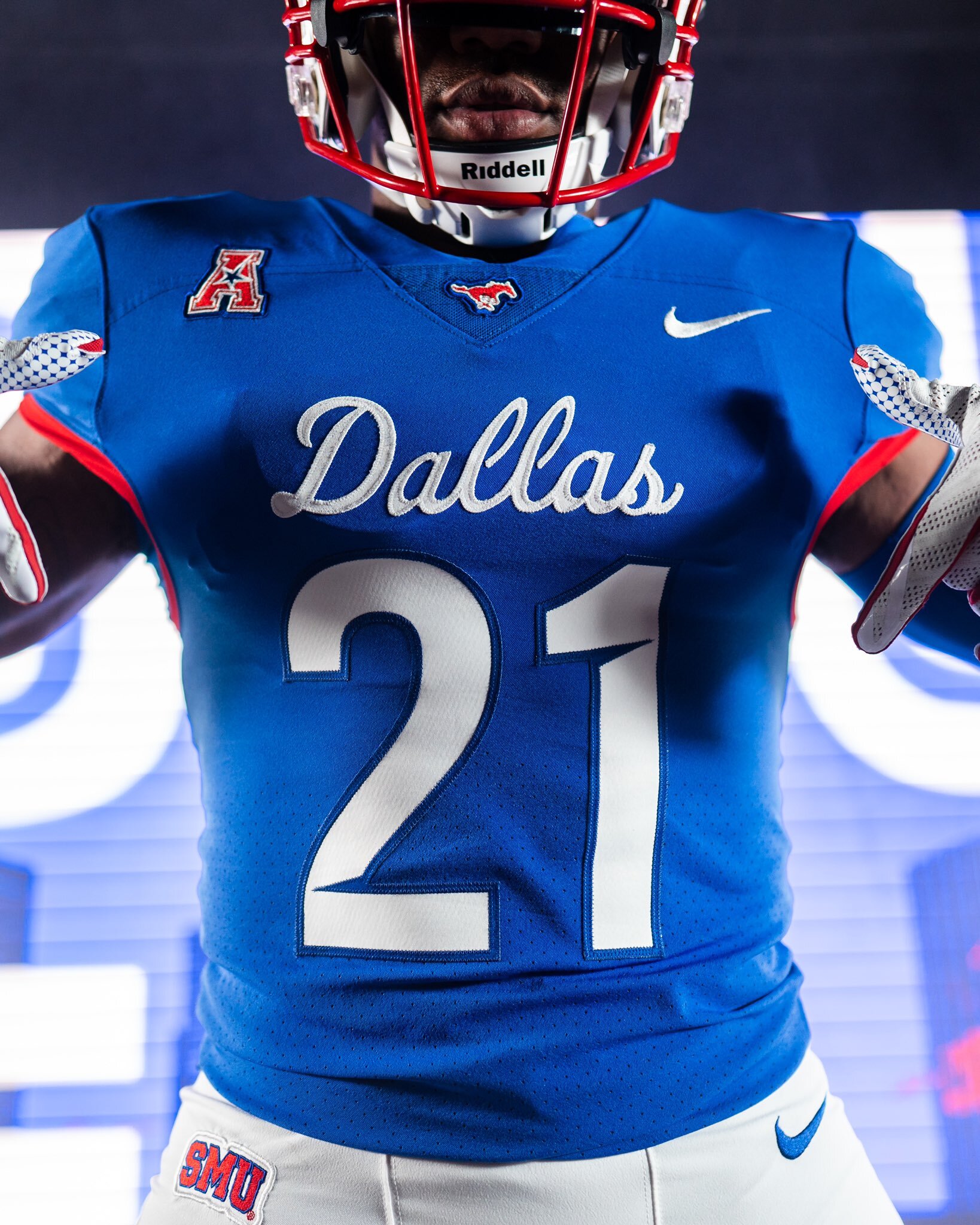
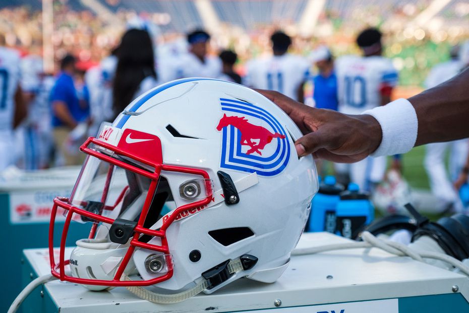
8: SMU - 'Dallas Blue'
SMU are fast becoming one of the smartest teams in college football, and 2021’s offering is right up there as one of the iconic uniforms of the last ten years. On the back of the success of their white ‘Dallas’ uniforms from 2020, The Ponies released their home blue version last season. The classic italic Dallas script returns, and the bold blue uniform with red trim pairs perfectly with the white helmets – which sport the classic galloping mustang over the top of the retro ‘D’. If it wasn’t just inverted from the previous year, it would be almost perfect.
If SMU looked this good back in the eighties, it’s fair to assume they wouldn’t have needed to pay the likes of Eric Dickerson to come to Dallas. This kind of drip has it’s own pulling power.
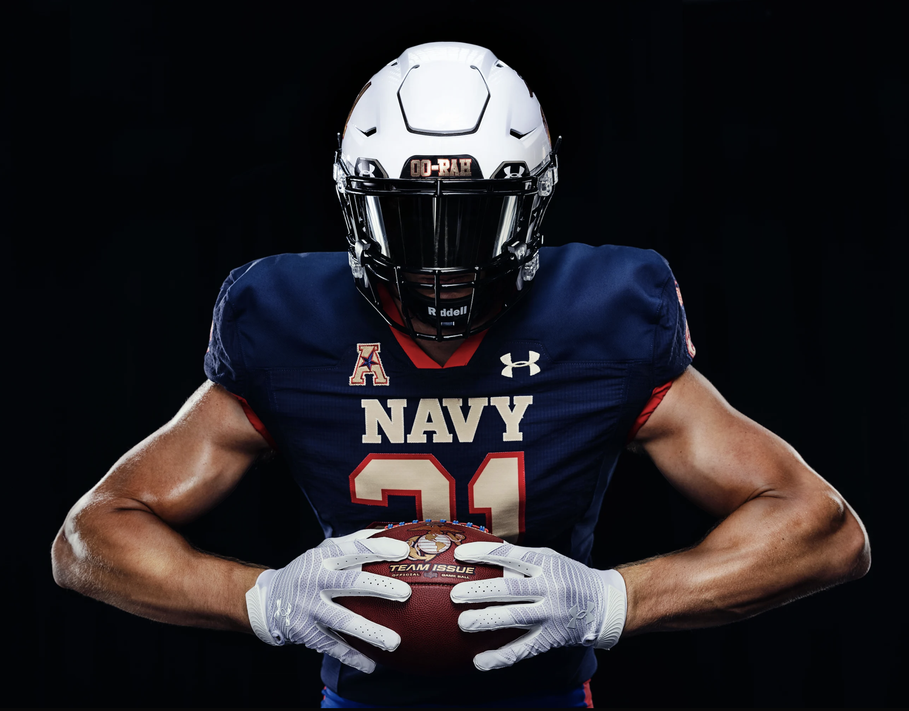
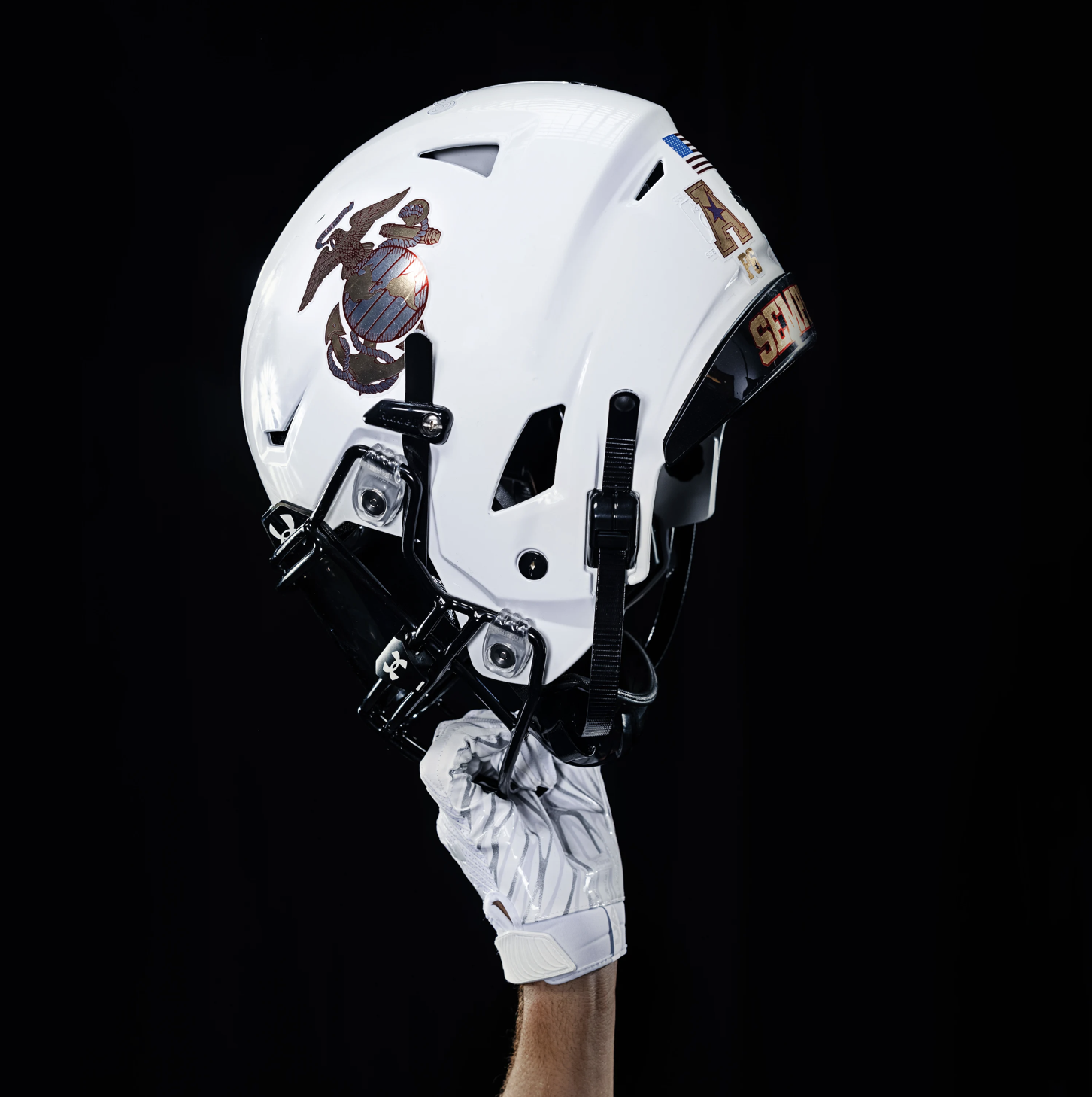
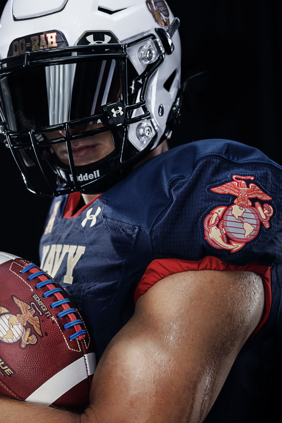
7: Navy - 'Dress Blue A'
These are seriously smart.
Navy enters the top 25 for the second time this year with their ‘USMC’ uniforms, designed to perfectly mimick the academy’s iconic ‘Dress Blue A’ attire of white hat, navy jacket and blue trousers. The attention to detail, if you will excuse the pun, is almost militant – the pants sport the traditional ‘blood line’ down the side, used to signify the promotion from Lance Corporal to Corporal. The Eagle, Globe and Anchor motif synonymous with the Naval Academy is found on the left sleeve, pants and helmet. And the names on the back have been replaced with the words ‘Semper Fi’ – a latin Navy motto that translates to ‘always loyal’.
Perhaps the best touch is the helmet front plate that sports the feral, guttural Marine cry of ‘OORAH’. The Midshipmen showcased this uniform in their 23-3 defeat to Air Force. Hopefully it returns again this upcoming season.
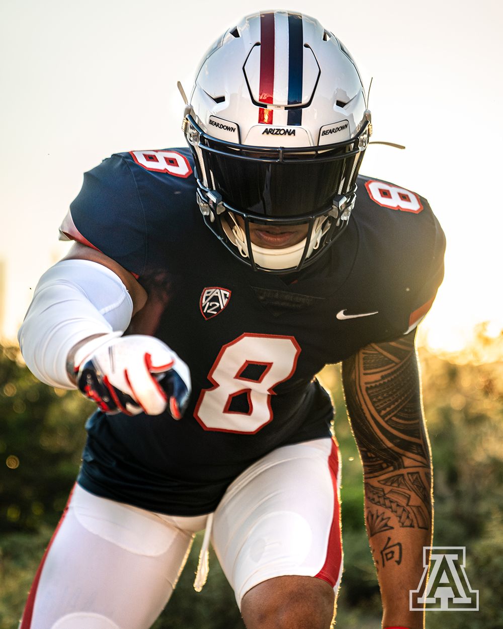
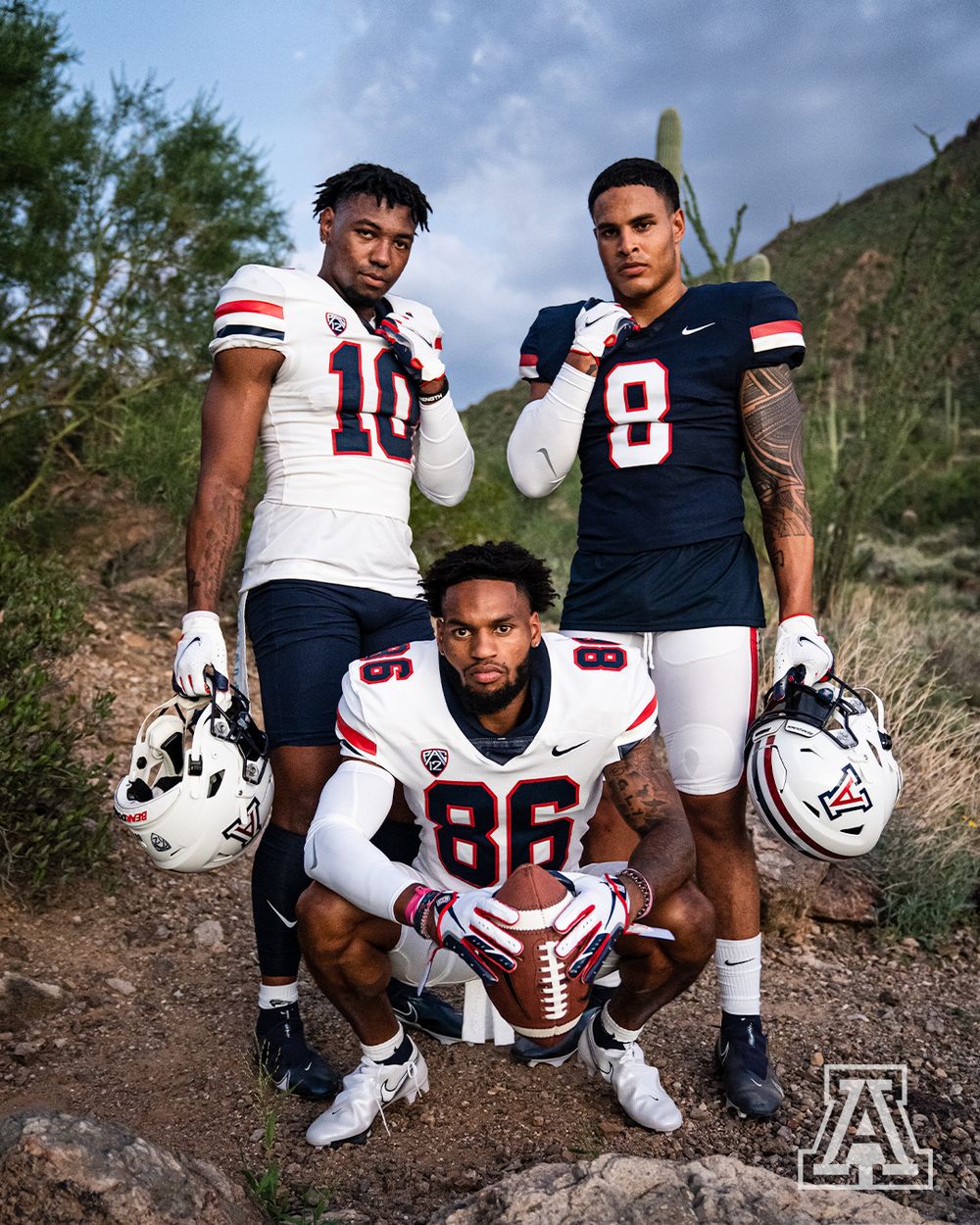
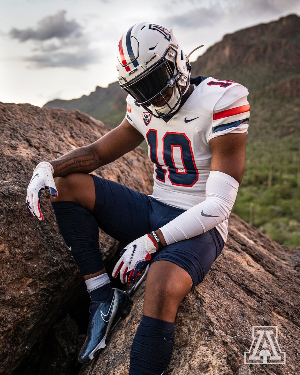
6: Arizona - 'Desert Swarm'
Calling Arizona the Kansas of the PAC-12 mght be a tad harsh, especially as they seem to be heading in the right direcion under Jedd Fisch. But the poor results of the last decade aside, the Wildcats – similar to the Jayhawks – were in desperate need of a refresh when it came to their on-field attire. They basically looked like the Houston Texans – boring, insipid, and uninspiring.
Going backwards is sometimes the key to progression. Just look at these retro uniforms! Arizona reverted back to their look from the ‘Desert Swarm’ era, when legendary head coach Dick Tomey led them to double digit wins for the first time in their history in 1993. The name originates from their intense, swarming defense, which was the backbone of their success.
The bold, contrasting colours and lighter red hue work perfectly. Lets hope this strong look can inspire another era of promise in Tuscon.
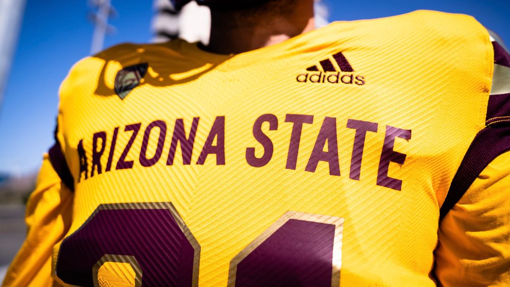
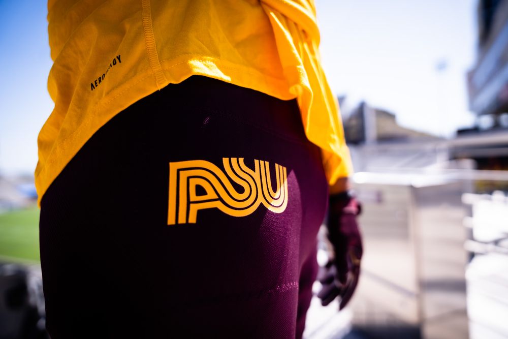
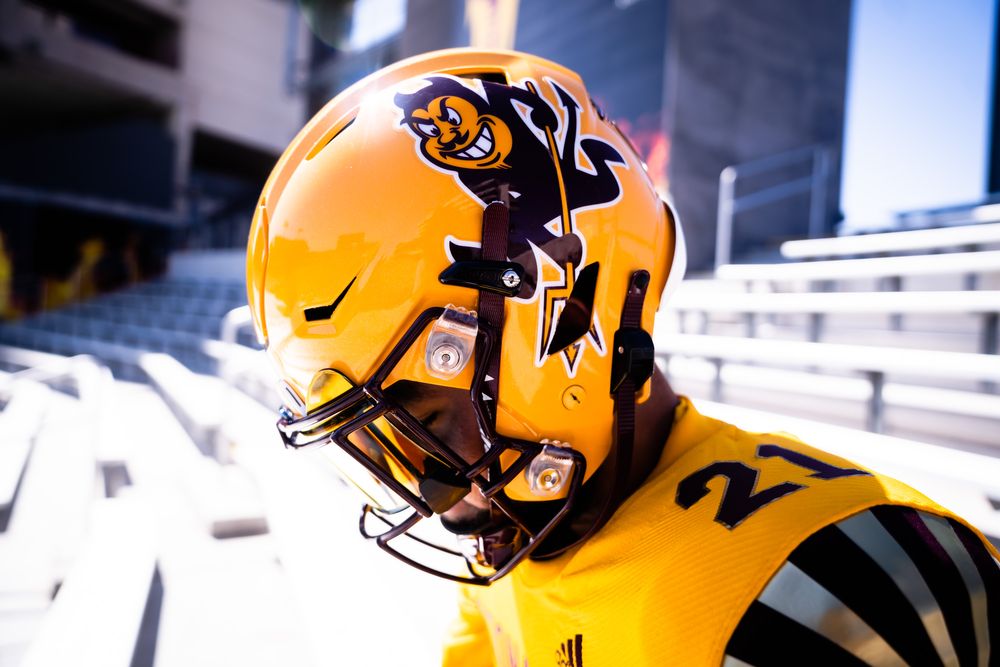
5: Arizona State - 'Reverse Retro'
I’m all in on the Adidas ‘reverse retro’ movement. First they upgraded Kansas’ outfit, and now they deliver this absolute beauty of a uniform!
ASU have always had a pleasing colour palette – the purple-maroon and yellow-gold very much invoking thoughts of the intense heat of a Tempe sunset. Inverting the colours and adding the bold ARIZONA STATE name across the chest is a power move, with the starcast sleeves adding a touch of style.
The ensemble is completed with a nice retro ASU at the top of the pants, and the impish Sun Devil adorning the helmet. Quite simply, if you don’t like this look, then you’re dead inside.
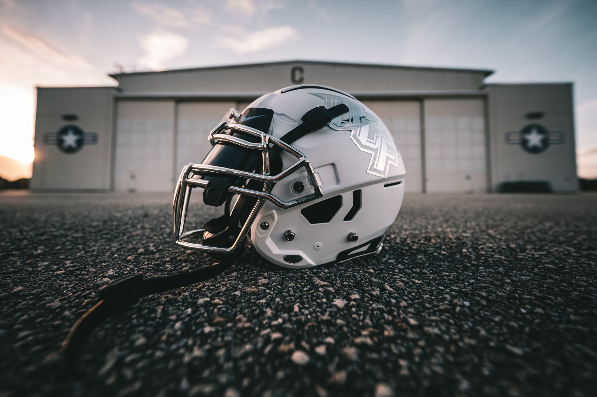
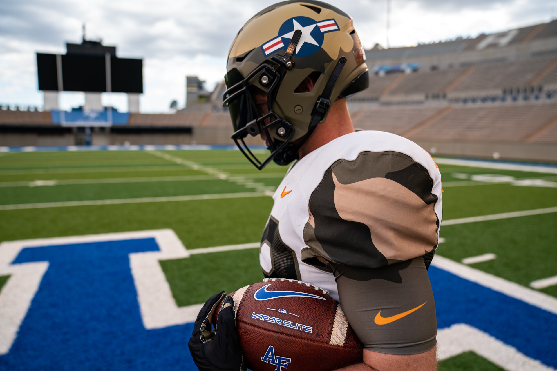
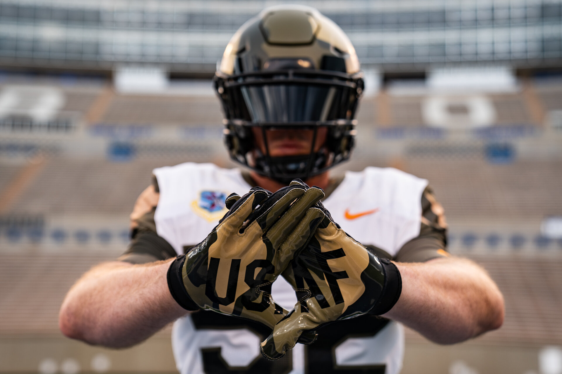
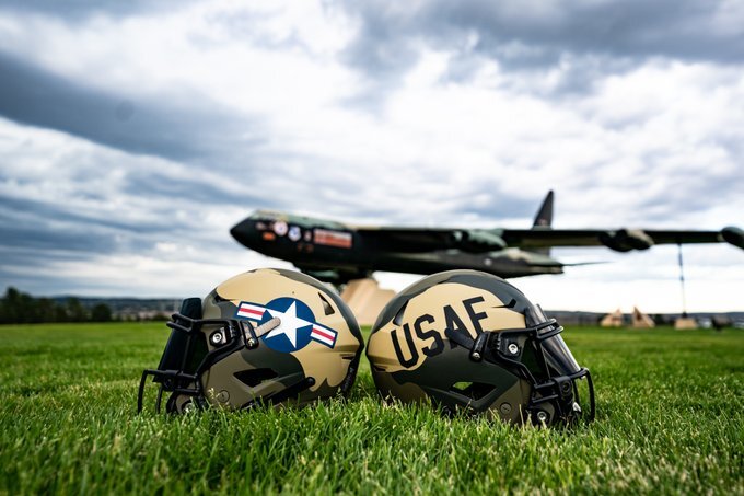
4: Air Force - 'Linebacker II'
With Navy bringing their uniform A-game to their rivalry matchup against Air Force, the Falcons knew they were compelled to do something special too. And boy did they do that…
Choosing to honor the B-52 Stratofortress, The Zoomies unveiled their ‘Linebacker II’ uniforms. The B52 plane featured prominently in the Vietnam War, and was particularly effective in evading the impressive Vietnamese air defense systems. The helmet was painted in the Southeast Asian camo, with the roundel on one side and ‘USAF’ on the other, whilst the team used their nameplates to represent all the former B52 units.
There was eleven days of bombing in the conflict, which is depicted in the eleven silhouettes of the airplane in the trousers. The complete effect is truly astonishing – whilst the military garb achieves it’s goal of saluting the academy’s past, I really love the oversized numbers that I think helps bring it all together.
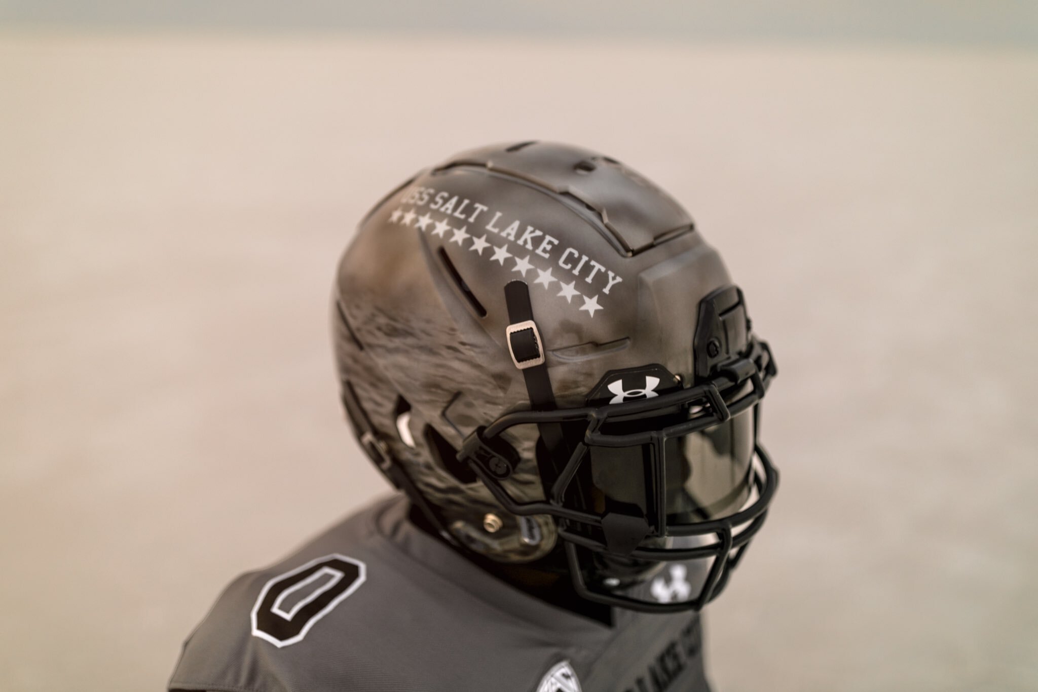
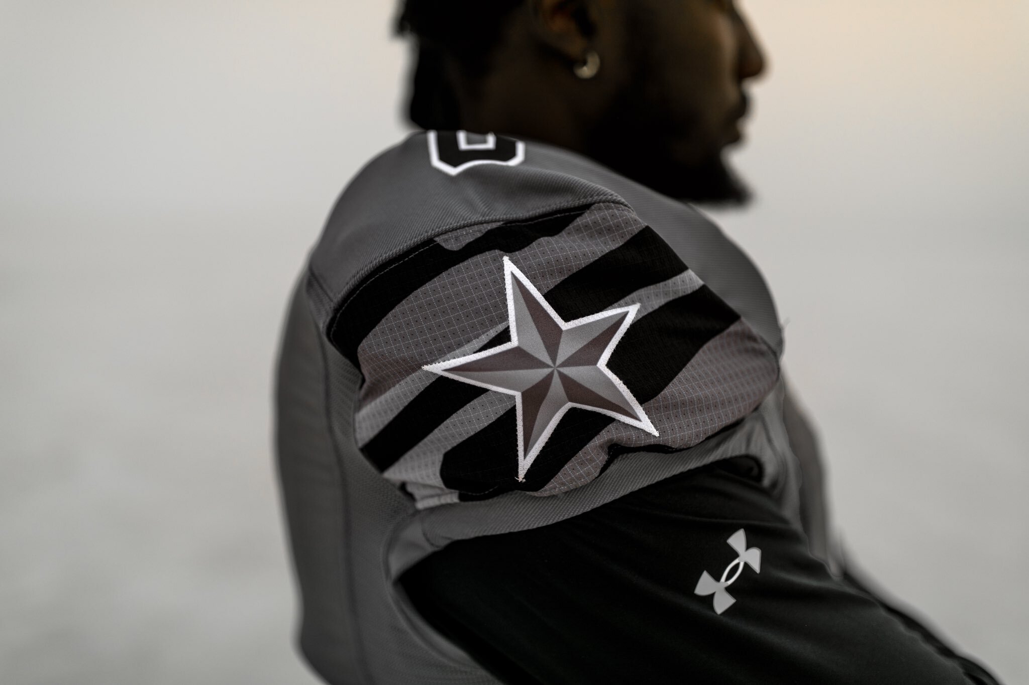
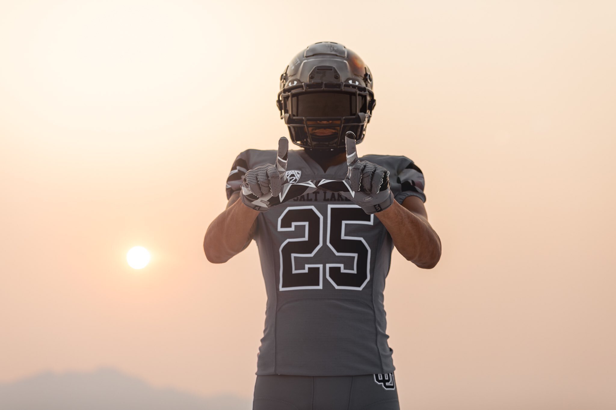
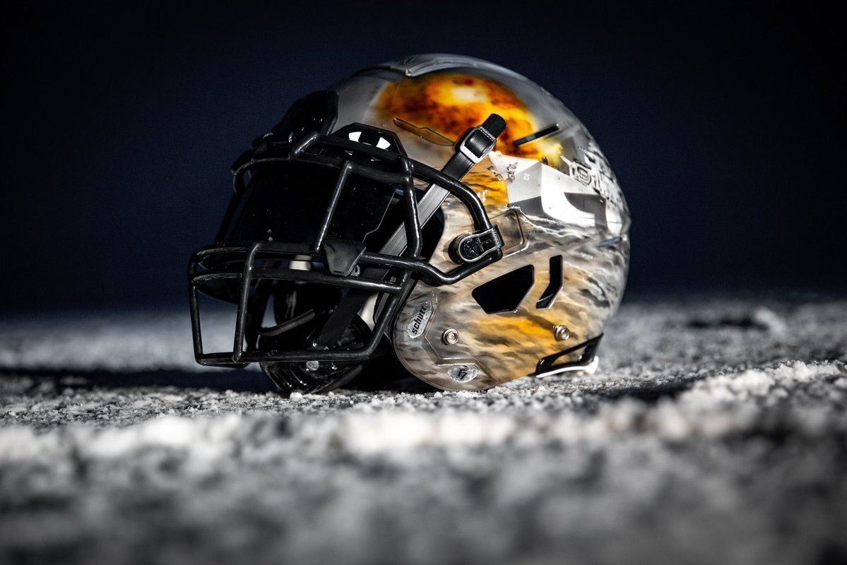
3: Utah - 'USS Salt Lake City'
Sneaking in to the top three – and deservedly so – is Utah, who have already been recognised in this list for their commitment to on-field fashion. The Utes decided to pay tribute to the USS Salt Lake City – a World War II heavy cruiser – when hosting Oregon at Rice-Eccles Stadium last November. The light grey jersey features the distinctive camouflage patterns from the warship, and the black numbers sit proudly on the backdrop, emboldened with a sharp white outline that quite honestly takes the look from good to great.
The helmets though, are ridiculously detailed. Each one was hand painted with a battle that the ship fought in on the left side, whilst the right keeps it simple, with just the words USS SALT LAKE CITY in small type sat on a row of stars. The final flourish? Each jersey had one battle star on the right shoulder, meaning the eleven men on the field would represent the eleven battle stars earned by the ship during WWII.
They’re just too good.
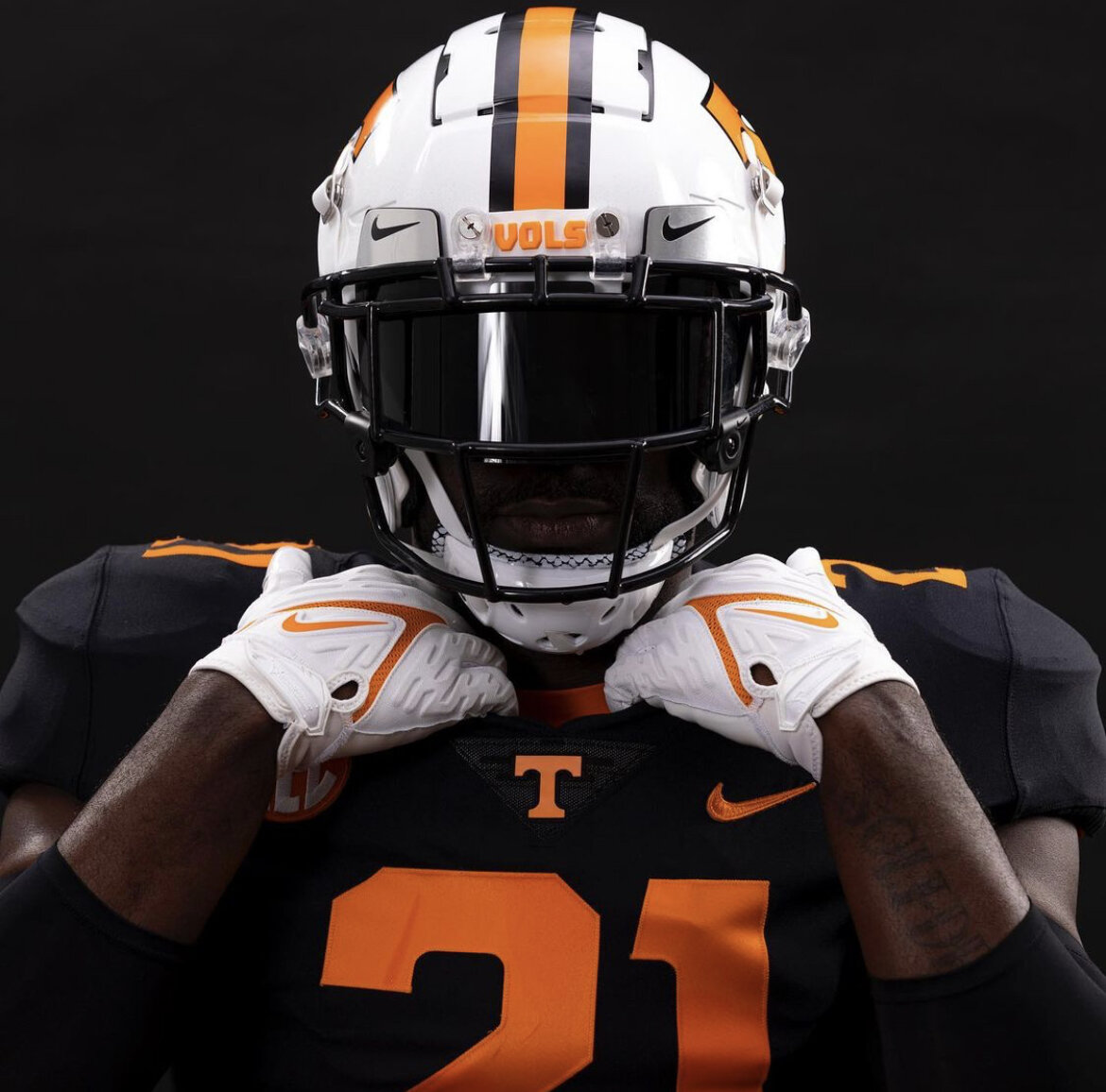
2: Tennessee - 'Dark Mode'
What is the main function of an all-black jersey and pants combo? To look as menacing as possible of course. Many a football program have tried – and failed – to pull off the effect. Well, on the 9th October 2021, Tennessee managed to perfect the art of the blackout uniform, because it turns out that ‘PMS 151’ – otherwise known as ‘Volunteer Orange’ – is the perfect accompaniment to a jet black outfit.
These ‘Dark Mode’ uniforms are flawless. Every last detail works. The colour contrast is balanced perfectly by the volume of orange – just number (no outline), Nike tick, T and SEC logos on the front, and name and number on the back. Don’t overthink it folks! The two stripes down the pant leg also deliver the requisite amount of colour necessary. And whilst I may have been tempted to finish the ensemble off with black accessories, the white gloves and helmet make the whole thing pop off your television screen.
I truly felt sorry for South Carolina. The final score of 45-20 was sealed as soon as The Vols strutted out of the tunnel. Whoever designed the Dark Mode concept should be given the freedom of Knoxville.
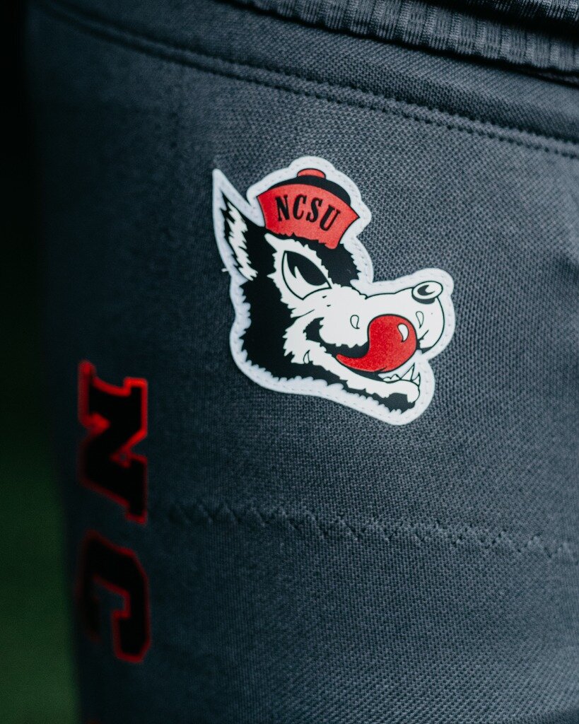
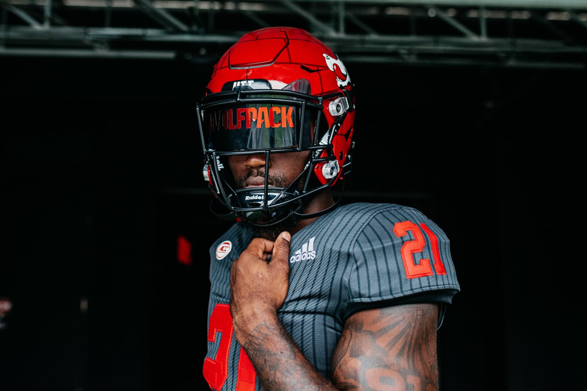
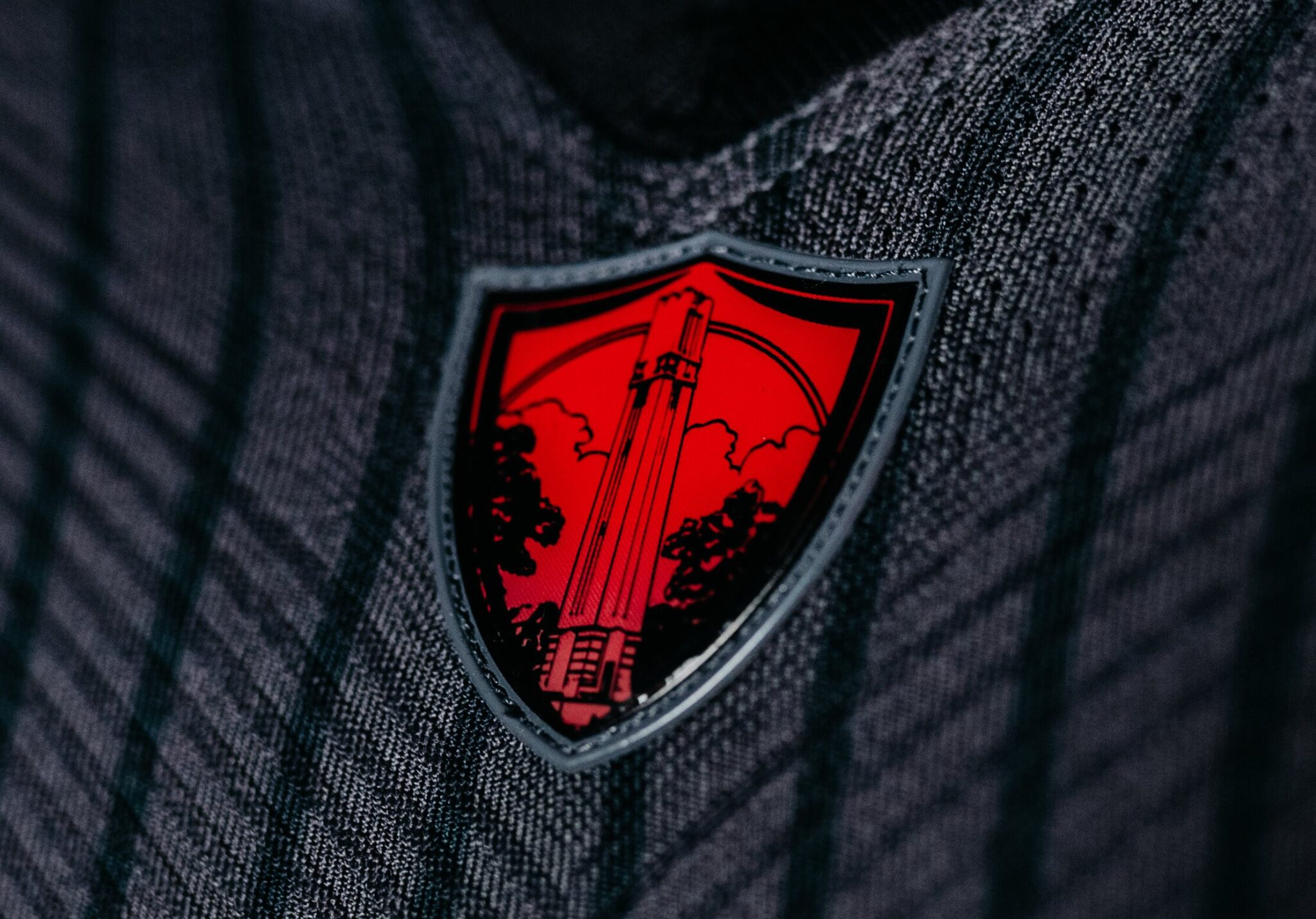
1: NC State - 'Light It Red'
And finally, we have our champion. The supremo of 2021, the uniform to which no other school could compete. Considering this is a rigged voting system headed by myself and nobody else, it’s quite shocking that a white or powder blue outfit didn’t take home the prize. But sometimes you’ve just got to take a step back and admit when something is too good. And when Adidas and NC State put their heads together, that’s exactly what they came up with…
For those that don’t know, North Carolina State have a tradition of lighting their iconic Memorial Belltower red following a Wolfpack victory. To commemorate this tradition, Adidas delivered these magnificent ‘light it red’ uniforms; the collar shield depicts the famous belltower, whilst the helmet has the brickwork design that the structure possesses. There is a retro element to the uniform, with the older ‘slobbering dog’ logo prevalent. But the best bit is the grey backdrop, which not only allows the red numbers and lids to pop, but is also in the colour and style of the sweater that their mascot Tuffy used to wear.
The perfect blend of nostalgia and style, set to a brief that is poignant and important to the football program and their fanbase. Congrats to NC State – you can light the belltower red for this victory too!
PREVIOUSLY THE FOUNDER OF NFL DRAFT UK, SIMON HAS BEEN COVERING COLLEGE FOOTBALL AND THE NFL DRAFT SINCE 2009. BASED IN MANCHESTER, SIMON IS ALSO CO-CREATOR & WEEKLY GUEST OF THE COLLAPSING POCKET PODCAST.